Website design is a challenging balancing act for colleges and universities. Not only are there numerous diverse audiences to appease, a continuous flow of fresh content necessary for user engagement and SEO, and extensive information to convey clearly and concisely – but prospective students are also looking to your website for something indefinably more, something that makes you stand out from the crowd to convince them that your school is their perfect fit. Precisely what that extra something is remains highly arguable but suffice it to say that school websites are significantly and increasingly influential when choosing where to study.
The just-released Noel-Levitz 2014 E-Recruiting Practices Report confirms that website spending has increased in the past two years, although only about half of four-year higher ed institutions reported having a mobile-optimized site. With 71 percent of graduating high school seniors having viewed college websites on mobile phones or tablets (and 43 percent of teens exclusively mobile), mobile functionality needs to be a top priority for every school. First impressions are critical when forming an opinion about any brand and when it comes to evaluating higher education institutions, study after study states that teenaged prospects won’t hesitate to abandon a poorly functioning website, potentially eliminating that college from their application list.
What makes an effective college website?
It isn’t necessary to be as big as Harvard to create an effective website – there are plenty of examples of small career colleges doing it well. The key is to approach web design strategically, from a long-term, big picture perspective. Develop a navigational framework and content creation process that is sufficiently flexible to evolve along with your organization. This may take a full redesign the first time around but if you plan it correctly the infrastructure should be sustainable even as academic offerings and user needs change. A website is a perpetual work in progress, so plan for constant testing and regular updates. Identify what makes your school unique and what your visitors are most interested in, then make it as easy as possible for them to get there.
One of the biggest challenges for higher ed web design is finding a way to communicate the most relevant information without cluttering the user experience. This means taking a hard look into Google Analytics data for underperforming pages and cutting out redundant, superfluous, outdated and conflicting content. Confusing graphics, option overload, broken links, and long loading times (more than 2 seconds!) are sure to frustrate your visitors. Put yourself in your prospect’s shoes to inspire them to conversion by providing easily scannable content, bold high-quality photographs, and prominent calls to action. Your beautiful, modern look should be applied throughout the website – not just the homepage – ensuring optimal engagement no matter which page your visitors first land on. Responsive design automatically formats content to fit the user’s screen size, and it is even more imperative that clutter is eliminated on mobile browsers for efficient task-driven action.
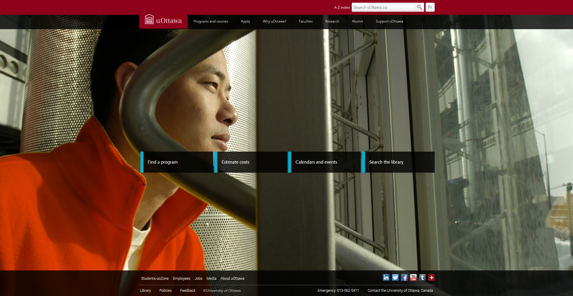
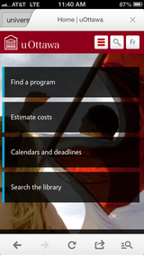
Example: The University of Ottawa’s recently redesigned website has been lauded for being particularly clean and simple, offering visitors only four prominent links in the page’s centre. Data-driven research suggested the top tasks for student recruitment were “Find a program” and “Estimate costs”, which are even more prominent on their mobile-optimized site.
Provoking emotion to drive action
OK, you’ve simplified navigation and created great content – now what? You want students to be excited about your school, alumni to donate and prospects to sign up, so share that contagious enthusiasm of your unique community with bold branding and a sensual multimedia experience. More colleges are integrating visual content in interesting ways, inspiring the emotions that result in action. Authentic images of students on campus trumps stock photos every time. Increase interactivity with virtual tours and embedded videos, delivering a visceral simulation of life at your college or university. This is a quickly growing trend, as student searches for educational terms on YouTube increased by 25 percent in the last quarter of 2013.
As students sift through a multitude of higher education options, why should they choose you? Of course, your programs, facilities, industry recognition, instructors, placement rate, location or whatever else makes you special should be emphasized, but some schools are attempting to stand out from the crowd with provocative web design. If you get too inventive you risk confusing and polarizing your visitors but you may also inspire the positive emotional reaction that leads to application. It is another case of the medium being the message, but style should complement the substance, not overwhelm it.
Example: Bucknell University’s recent redesign certainly spurred passionate reactions, at least among higher education marketing observers. Karine Joly wrote an insightful article summarizing the harsh critiques from respected consultants Bob Johnson and Gerry McGovern plus an interview with Bucknell’s Director of Digital Communications, Roberta Diehl, to better understand their motivations.

Critics of the site are confounded by the lack of typical navigational options and the presence of unusual features, such as the dates on the left and the clock at the top-right. The customization feature, which allows visitors choose which information they would like to see on the page (remembering for the next visit), was also deemed confusing.

The site actually looks very good after the initial bewilderment passes, it’s just that you have to scroll down and dig deeper to get to the goods. The search function is particularly excellent, generating a wealth of dynamically returned suggestions for specific queries. What some call “cute and clever” at the cost of functionality is intended to be “conversational” to each user, inviting exploration without providing an overwhelming list of options. “We happily ditched the entire notion of a traditional navigational structure, and instead approached the site as a series of experiences, uniquely suited to a visitor’s needs and perspective,” says Tracey Halvorsen, President and Chief Visionary Officer at Fastspot, the site’s designers.
While having the bulk of direct navigation below the fold may be a controversial choice, the fully responsive site is modeled after typical scrolling behaviour on smart phones and tablets. In this way they have accomplished their stated strategic goals of standing out in a sea of similar looking sites and seeming “a little bit ahead of its time so that it will still have legs three years from now, or more,” according to Diehl. Early analytics data suggests overall visits have somewhat decreased since the redesign (for whatever reason), but time spent per page has increased 17.5% and homepage bounce rate has dropped from 34.29% to an impressive 7.84%.
Another attention grabber with the “revolutionary” Bucknell redesign was the pre-launch hype in the form of an Apple-referencing video, promising “customization, navigation and content never seen before in higher education.” Although some saw the loud broadcasting as traditional marketing tricks getting in the way of visitor objectives, the school simply viewed it as a fun way of building buzz while acknowledging the significant departure from the previous site.

Functional doesn’t need to be boring
Whether or not you like the Bucknell redesign, it raises healthy questions about what the next generation of higher ed web design should look like. Are you creating the most engaging site for your particular target market or following the supposed best practices of what everyone else is doing? Internal and external usability testing will tell you if you’re on the right track, especially with a more unconventional design, identifying slight adjustments that can make all the difference in achieving intuitive navigation.
Example: Furman University’s website has a great look, full of appealing pictures that capture their inspiring school spirit yet anchored by a bookmark-style navigational menu on the left that remains stationary wherever you are on the site. Visitors can “Experience Furman” by scrolling through an innovative timeline-style posting list, familiar to any social media user, which can be sorted according to news, events or social.

Example: Regent College is a small Canadian graduate school of Christian studies that has done a great job with its colourful website, showing off engaging images of its students and beautiful Vancouver surroundings while offering lots of good information in a way that makes you want to come back for more. Various sections light up when hovered over, there are well placed images and calls to action in the colour-coded dropdown menus, and several tastefully produced videos prominently available. Lots to like here!

The bright future of higher ed web design
What all of these shining examples of bold new higher education web design have in common is a commitment to engaging, somewhat playful, mobile-friendly aesthetics. Prospective students who have lived with the internet since birth are interested in interacting with institutions that demonstrate a forward-looking perspective and vibrant web experience. We expect to see bolder designs from colleges and universities in the coming years as innovation becomes integral to brand statements.

Which college or university website do you find particularly innovative?


