While there are many organic ways to recruit students through digital marketing, one of the best tactics for getting results quickly and efficiently is to use paid advertising campaigns on platforms such as Google, Bing, and Facebook. Even though many schools leverage paid ads to generate direct inquiries, a lot are compromising the effectiveness of these endeavors by making simple mistakes on their landing pages, or not having landing pages at all.
Effective landing pages can mean the difference between a booming enrollment season and struggling to meet your admissions goals. Schools can work to make their landing pages as effective as possible by being aware of common pitfalls and working to correct them.
The next time you’re developing new landing pages for your school, make sure you watch out for these common mistakes.
1. Redirecting to the Homepage or Including External Links
One of the most common mistakes that schools make with their paid advertising campaigns is sending the prospective student to a generic webpage, usually their website’s homepage, instead of a designated landing page. There are several issues with doing this that can drastically reduce the effectiveness of your paid campaigns.
Firstly, when a potential student clicks through on your ad, they immediately need to see that the webpage is directly related to the information in the ad’s copy, or they could be turned off. If they are directed to your homepage, the user may feel mislead or confused, and exit your website as a result, losing you a potential prospect.
Secondly, your school’s website homepage is likely to have a lot going on. Information overload can make it difficult for prospective students to find what they are looking for. With images, text, and links relating to a variety of different programs, departments, and topics to distract them, it will be much harder for the prospect to reach the relevant page of your website, read the information they need to know, and convert by completing a lead generation form or calling for more information.
For these reasons, creating dedicated landing pages for your campaigns that have no links to other parts of your site is essential for success. By making it easier for the student to access the information they need, you will likely boost your conversions and lower your cost per conversion (CPC) dramatically.
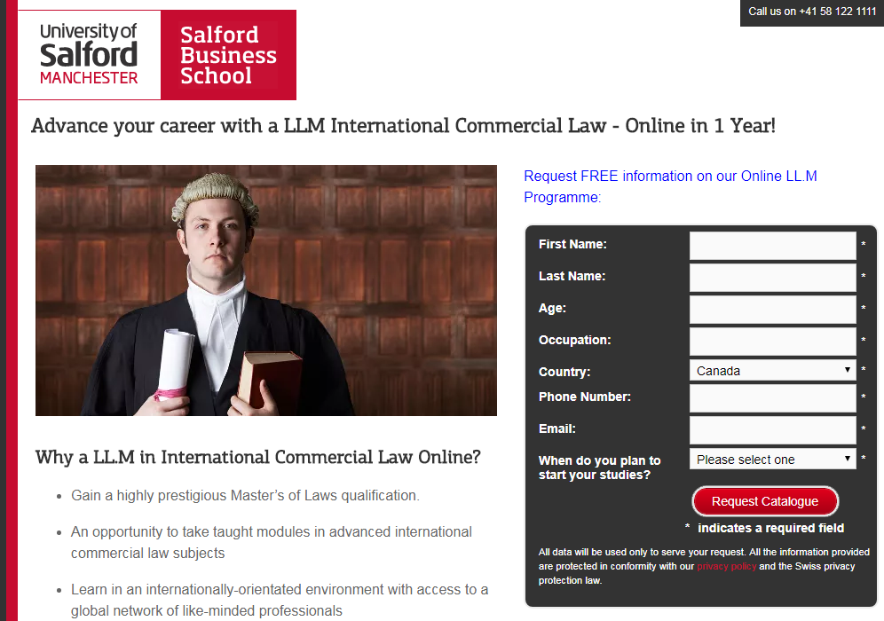
Example: The University of Salford advertises its online LLM program on Google AdWords. When the ad is clicked, the user is directed to a designated landing page where they can fill out the form for more information. Because the landing page contains no other links, the prospective student only has one clear action to take, without any distractions.


2. Creating Education Landing Pages with a Crowded Design and Too Much Text
When it comes to education landing page content, providing bite-sized and easily digestible information is the key, as you only have a few precious moments to capture and keep a prospective student’s attention. If a potential applicant visits your landing page and is greeted by a cumbersome block of text, they are much less likely to invest the time reading the page for the information they need.
Here are some easy-to-implement ways your school can improve the user experience and make your landing pages easier to read:
- Use numbered or bulleted lists (like this one!)
- Use white and empty space
- Write in short, to-the-point paragraphs
- Present only the most important information and facts
- Logically organize your landing page content with optimized headings
- Strategically use visuals and images to reinforce the landing page’s message
Example: Unity College Online uses bulleted lists to present key information about earning an MBA online with their school. The landing page has plenty of white space, minimal but useful text, easy-to-read titles and text, and a clear form.

3. A Long Load Time Can Cost You Prospective Students
According to Kissmetrics, a four-second load time can increase the rate of users leaving your landing page by 25%. Thus, fast loading times are extremely important. It can be tempting to add lots of graphics and videos, but even if those features are enhancing your landing page, it could cause more harm than good if they are significantly slowing the load speed. As a result, schools need to take the necessary steps to make sure their landing page’s load speed is up to par.

Source: Kissmetrics
The first step to improving your landing page’s load speed is to simplify and clean up the design, as well as the page’s code. The more elements on the page, the more HTTP requests are made, which slow down the page’s ability to load. Next, you want to make sure that the server you’re using has a response time that is less than about 200 milliseconds.
You’ll also want to look at optimizing the images on your page, ensuring that they aren’t excessively large files and that the format is either JPEG or PNG. Finally, minimize redirects where possible, and ensure that you aren’t using any unnecessary WordPress plugins that will slow your landing page’s speed.
Don’t forget to consider your landing page’s load speed on mobile devices, too. Individuals using their mobile phones to browse the internet expect the same experience they would have using a computer, and most will only wait six seconds before exiting a page because it didn’t load quickly enough.
4. Ineffective Lead Generation Forms Hurt Education Landing Pages
The whole purpose of education landing pages is to generate leads and student inquiries, so it’s crucial to have an optimized lead generation form on each one. Lead generation forms serve several important purposes. First and foremost, they capture student leads, so your school can follow up with them. Second, by asking the right questions, lead generation forms can help your admissions team qualify the lead. And third, lead generation forms make it easier for students to reach out to your school without having to send an email separately or make a phone call.
The first mistake schools tend to make with lead generation forms is asking the prospective student to complete too many fields or provide information that is too personal. You should aim to ask enough questions that you can qualify the student, without overwhelming them. Typically, asking for a potential applicant’s name, email, phone number, program of interest, and desired campus is enough to get the ball rolling. However, depending on the nature of the program, you may ask additional qualifying questions, such as the students’ level of English, work experience, past education, or current location.
The second mistake schools make it failing to pair the lead generation form with an effective call to action (CTA). You want to create a CTA that entices the user to complete it and take the next step. It’s not uncommon for schools to use buttons that say “next” or “submit”, but by doing so, they are losing out on a valuable opportunity. Effective CTAs should be more along the lines of “Get your free brochure” or “Send me more information”, using action words that push the prospective student to take the next step.
Example: The Language Gallery is a language school that provides English courses across the globe. The lead capture form on their landing pages is simply formatted, easy to navigate, and has all the necessary fields, as well as several specific fields relevant to the nature of its course offerings, such as the prospective student’s country of residence and nationality. However, the landing page could be improved even further by using a more effective call to action such as “Send me more information!”

5. Not Keeping Your Student Personas in Mind is a Big Landing Page Mistake
The final mistake that schools tend to make is writing their landing pages without a student persona in mind. If you haven’t crafted targeted student personas for your school, it’s worthwhile to take the time to do so. Creating a persona allows you to think carefully about who the ideal student for your school or program is, what their background, motivations, concerns, and needs are, and how you can demonstrate that your school is the best option for them.
By keeping these personas in mind when writing landing pages, you can present the most persuasive information possible to entice prospective students to convert. For example, if your prospective students are worried about their qualification being recognized in different countries, you could include details about accreditation and recognition. Or if a student wants to make sure they’ll have career success after completing your course, you could include testimonials from past graduates. While these details may seem small, to your target persona, these additions could be enough to make them feel confident in your school’s offerings and convert.
Example: Reeves College in Edmonton, Alberta includes on its landing page testimonials from past graduates that attest to the quality and effectiveness of the Medical Office Administration program.

Ensuring the effectiveness of your paid advertising campaigns and associated landing pages is essential. Regardless of the size, budget, or targeting of your campaigns, making mistakes on your landing pages could result in your school failing to reach its enrollment goals.
However, by implementing the changes and improvements suggested in this blog, and taking a few cues from some of the positive education landing page examples we’ve highlighted, your paid advertising efforts can reach new heights.


