It may come as no surprise that a well-designed website can go a long way in advancing your school’s marketing efforts. In today’s congested digital space, websites are constantly competing with one another to attract and retain the interest of online users.
This is the case when prospective students visit school websites—a platform they use to formulate that critical first impression. According to recent survey data from Top Design Firms, about half of consumers consider web design to be important to a company’s brand. Schools can use their web design as an extension of their brand, showcasing their unique qualities and giving prospects an insight into who they are and what they are like.
But how can schools use web design to successfully draw in prospects?
A new web design project can sometimes be overwhelming, with many factors that need to be considered. That’s because good web design goes beyond great aesthetics; it includes everything from striking visuals to a pleasant user experience. To answer this question, HEM web design and development experts have provided a list of 7 must-have features that can significantly enhance your school’s website design.

1. Attract Prospects with a Modern and Functional Higher Ed Website Design
Design can be subjective, but a good web design ultimately has the same key features. Jhunmil Quin Dagandara, a member of our web development team, describes good web design as “functional, aesthetically pleasing, consistent with the branding, engaging, and accessible to all users.”
To Jason Tavares, our Lead Designer and Client Support Manager, it starts with an attractive interface. “When you log on to the website or webpage, I feel it has to instantly strike you as good. And to me, what it involves being good is that it has to look modern [and] clean. It has to look professional, and then when you dive deeper, it has to be effective.”
A well-designed website avoids cluttering the page with blocks of text, adopting a clean and professional look instead. This can be done by utilizing whitespace, limiting the colour palette, and including engaging visuals. However, the key is to keep everything consistent with your school’s brand.
Example: Randolph-Macon Academy features a clean design as well as high-quality video in the hero banner of the homepage, engaging visitors and creating a strong first impression.

Source: Randolph-Macon Academy
Top Design Firms’ survey also reveals that 42% of visitors leave a website because of poor functionality—which can significantly affect a website’s bounce rate, the percentage of visitors who quickly leave the page instead of exploring further. To avoid this, schools need to give their design a clear purpose. “As far as key steps, you start with your end goal,” Jason explains. “That’s your key step and then you work back from there and you make it easy for the user to get to that end goal.”
Websites support multiple objectives and should be viewed as more than just a tool to provide prospects with information. They are leveraged to attract, nurture, convert, and close. Trust is built through a positive user experience, the kind of content offered, and the timing of when it is delivered. Ideally, the potential for a relationship is formed with a value transaction, such as relevant content in exchange for contact information.
At HEM, we pose specific questions to help schools determine their goal. This can include:
- What is the primary reason for your website (re)design?
- Are you looking to expand your target audience?
- What is it that makes you or your offering unique in the market?
- What special features must the website include?
2. Feature Different CTAs and Contact Methods to Boost Interactivity
It should be noted that prospective students have different needs and interests. Successful web designs cater to these differences, creating a more personalized user experience through a diverse range of calls-to-action (CTAs) and contact methods. This needs to be done thoughtfully and creatively using microcopy to guide the reader to respond by selecting the CTA offer that most resonates with them based on their place in the customer journey.
Here, your school should provide tailored CTAs for different features, such as live chat, virtual tours, and viewbooks. Below is an example from the University of Reading’s homepage, which includes a variety of customized CTAs:

Source: University of Reading
Career selector or builder-type tools are also growing in popularity, catering to prospects who are undecided about their studies. Your school can address this group by creating encouraging CTAs that guide their exploration forward.
Example: Algonquin College’s website includes a ‘Career Coach Tool’ that prospective students can access after submitting a form. They can explore careers and complete an assessment that directs them to a list of matched programs.

Source: Algonquin College
Offering prospective students different CTAs and contact methods can allow them to be more actively engaged with your school—maximizing your chances to interact directly with them. You can even offer extra content after they submit a contact form, like downloading a school brochure, to better motivate them to click. As Jason puts it, “You want to give those options because people will choose different channels.”
Pro Tip: To make sure that you’re using the right CTAs, consider A/B testing and tracking different CTA buttons on Google Analytics.
3. Spotlight Engaging Content and Visuals in Your Education Web Design
Great content naturally draws people in, and good web design makes room for that content to shine. Try to have your content ready before creating your education web design. That way, you can showcase your content in the most effective way possible.
Be sure to feature interactive visuals like embedded videos that play in the background of your homepage. Try to also incorporate images that reflect your student personas, allowing your website to resonate more deeply with your target audience. To take it a step further, you can even feature images and videos that show your school, your faculty, and your students—establishing trust and credibility with your audience.
When designing, be sure to also highlight your school’s unique selling proposition (USP). This might include industry expertise, high profile teachers, state-of-the-art facilities, or hybrid programs to name a few examples. Keeping that USP front and centre makes it easy for prospects to quickly identify why your school is the right choice.
Example: In addition to engaging visitors with a branded video at the top of the page, Penn State University’s homepage clearly spotlights key USPs, along with tailored CTAs that encourage visitors to learn more.

Source: Penn State
Jason also believes that having a blog is noteworthy. Many schools include a blog page in their website design, which can even help with their SEO efforts. A well-maintained blog can help build your reputation and credibility, position your school as a market leader with a vibrant community or a wealth of information to share. Highlighting this valuable content in your design makes it easier for prospects to develop a positive first impression.
4. Build a Strong Layout that Emphasizes Your School’s Programs and Key Services
Well-designed websites typically feature an easy-to-follow layout. Here, readability and scannability are key qualities you want your school’s website to have. Consider adding features like callouts, which appear as stylized boxed for featured content, or lists to draw attention to certain areas and improve the overall look and impact of your design.
Here, utilizing semantic HTML can be particularly effective. In Quin’s view, “Your design must be coherent with the structure that Google will [review]. Googlebot will read your HTML markup, so it should be well-written as well.” This means using tags like <form> and <article> as well as H1s, H2s, and H3s to help you organize your content and create a clear hierarchy.
“You want to have your more important information at the top [of your homepage],” adds Jason. “At the top, we have a video to engage the user and we have a contact form right away. Instead of having too much text there, we let the video do its thing and if it looks interesting to [prospects], they can fill out the form. But then, right below that section, we list all the programs, because that’s what they’re there for. Then after the programs, we [might] have the top blog posts, testimonials, some school accreditation or school affiliates, some potential career information […] and then, of course, the contact information.”
Example: Cumberland College’s website illustrates this layout approach by featuring a video at the top of its homepage and a contact form in the section right after, alongside key USPs. Users who scroll beyond that section will also be able to view all available courses in an intuitive format:

Source: Cumberland College
Design can easily get technical, but it’s important to keep it human-centric. Be mindful of your student personas when building your education web design and highlight offers and services that align with their own motivations and address pain points in your layout—such as career services or financial aid.
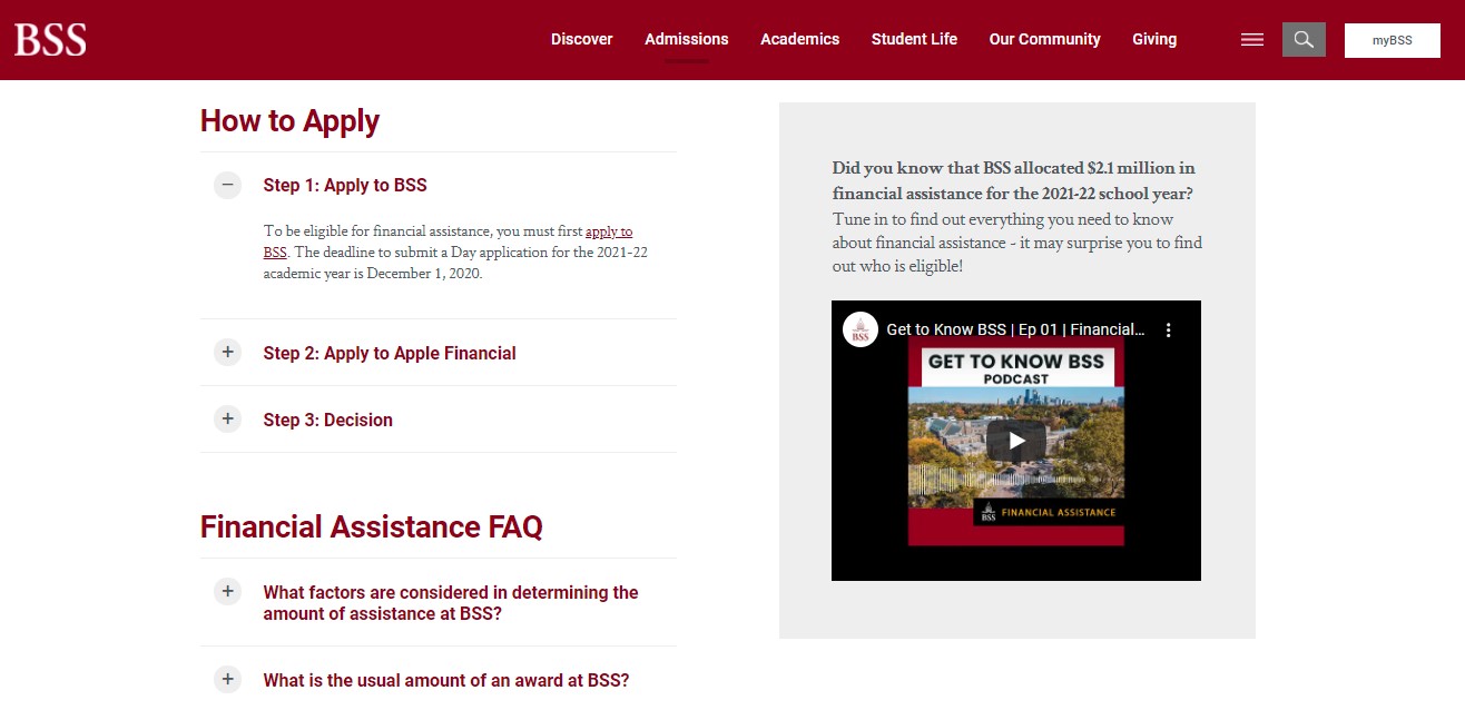
Example: The Bishop Strachan School makes it painless for prospects to access financial aid—with only one click. Their Financial Assistance page displays key information in an organized and intuitive way, using callouts and collapsible points that tie everything together.

Source: The Bishop Strachan School
Visitors who scroll further down this page can even learn about the impact of financial aid on a real recipient through images and a direct quote, making the website and school feel more human and community-driven. This can help you add authenticity and build trust with your audience.
5. Embrace Responsiveness and a Mobile-First Approach in Your School’s Web Design
“The proper way [to design] is mobile-first,” shares Quin. “Nowadays, the majority of users use mobile, so […] designing on mobile is a go-to process.” According to DataReportal, mobile phones make up around 53% of the time the world spends online, with 9 in 10 internet users going online via smartphone. Catering to visitors who access your website on mobile phones is incredibly important in today’s mobile-first age, especially since these visitors can include some of your key personas and target audiences.
In fact, recent data from GoodFirms shows that 73.1% of web designers view non-responsive design as a top reason why users may leave a website. If a website doesn’t display correctly on mobile and tablet devices, then it creates a negative user experience—looking outdated or taking too long to load, contributing to a higher bounce rate.
A responsive education website automatically resizes to suit the screen it’s being displayed on. Menus are often featured on the side as a hamburger icon and, at times, collapsed at the bottom for easy navigation. Design elements would typically be stacked on top of each other with collapsible or “swipeable” features to allow visitors to focus on specific parts of the content.
Example: The University of Copenhagen’s website provides mobile visitors with a pleasant user experience reinforced by a clean design that features a hamburger menu at the top right corner as well as an additional menu at the very bottom of each page. Their homepage also includes collapsible content and stacked sections with swipeable features for easy browsing.

Source: University of Copenhagen
Embracing a mobile-first design means creating a website that actively seeks to provide mobile visitors with the best experience possible without compromising desktop web design. It’s commonly understood that a web page that looks good on mobile will likely look good on desktop, but the opposite is not always the case.
Try to analyze your school’s web content first and tailor it to suit mobile view. “It doesn’t necessarily need to be shortened,” Jason begins.“[You] just need to put what’s more important at the top [of your web pages], so it does involve cutting up your content a little bit.” However, shortening your content and hiding certain elements in mobile view can sometimes be in your best interest. “You have to only put in the content that matters,” emphasizes Quin.
Recent data from Portent reveals that the first five seconds of page load time impact conversion rates the most—which drop by an average of 4.42% with each additional second of loading. In this way, faster page speeds can help you retain your mobile visitors. By removing extra content, your website will load faster on mobile. Quin recommends compressing images and Jason advises cutting down video content or even disabling background videos to improve page load time for users who don’t have a high internet speed.
6. Promote Accessibility and Simple Navigation through Student-Friendly UI/UX
While some prospects may want to just explore a site, others have a clear goal in mind. A good web design caters to both groups, making exploration fun and easy while also providing direct links to key offers. This means minimizing the number of clicks users need to get to where they want to go. Instead, make that link clear and intuitive.
Quin suggests going with a more minimal page. “The content should be light so that the [page] will load faster,” he describes. Sticky headers, simple styling, hover effects, and navigation are additional features that Quin recommends for student-friendly UI/UX.
Similarly, Jason recommends a clean and modern design for a good user interface (UI). He suggests being clear with your wording on CTAs and including a utility navigation feature to help improve the user experience (UX) on your higher ed website design.
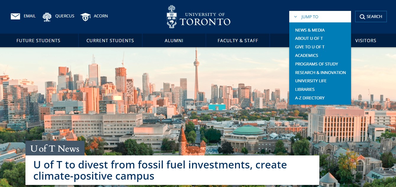
Utility navigation is a small menu, typically found at the top corner of a website, that reveals a list of links in order to declutter your main navigation bar. The utility feature is particularly notable as it provides prospects with constant access to key pages no matter where they are on your site, making navigation simple and easy.
Example: The University of Toronto features a utility bar and a main navigation bar that remain consistent on different pages of the website, making it easy for prospective students to access key pages on the site.

Source: University of Toronto
“When researching university sites, [schools] have an academic section for their programs. It’s so easy to get lost,” Jason adds. Visitors often need to click through many pages to find key information about specific courses or programs. “That’s how [schools] have their content organized [and] how they look at it internally. But in my opinion, you don’t want to do that. You don’t want to give the user four clicks when it could be two.”
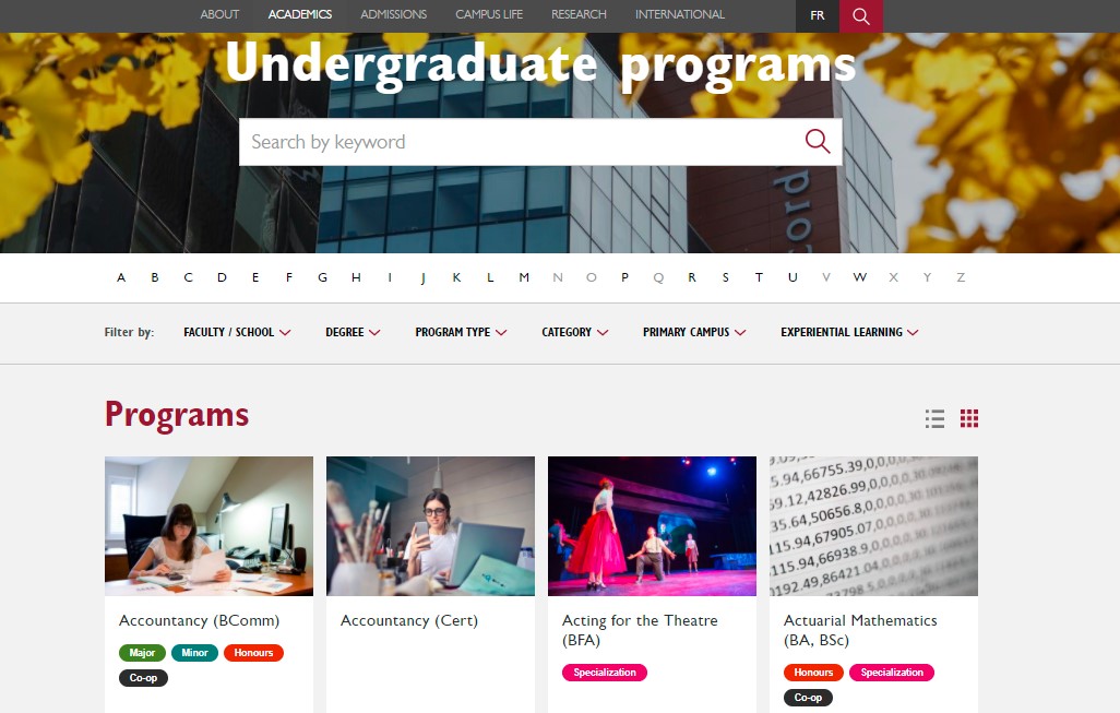
Example: The program pages for both undergraduate and graduate studies are easy to access on Concordia University’s website, each within one click. There, prospects can search for their program by typing a keyword, customizing filters, and changing the layout. Visuals and colour-coded tags also make it easy to scan and browse different programs.

Source: Concordia University
7. Showcase Your School’s Community by Adding Social Media Features
Your school’s community is a big selling point, which can attract and engage prospective students and their families. Consider incorporating social media into your school’s website design to showcase your community and entice visitors to learn more about it.
Social media is often the place where many prospects go to explore a school’s look and feel. Designing a visual way to incorporate those links into your school’s homepage can naturally draw in visitors and boost your social media engagement. It can even help your prospects feel closer to your school, giving them an “insider perspective” as they develop their first impression of your school on the website.
Example: At the bottom of York University’s homepage, visitors can see a visual grid of social media posts. Each individual post is interactive, allowing prospects to hover and click for more information.

Source: York University
Pro Tip: Schools that want to go further can even spotlight school events or workshops on their homepage, showcasing a vibrant community that is actively involved in current affairs, academic research or even industry-specific subjects. The image below shows how the University of Bucharest incorporates this feature on its homepage:

Source: The University of Bucharest
Conclusion: Design Your School’s Website with Collaboration in Mind
By analyzing your goals and audience, you can create a web design that effectively highlights what your school has to offer, letting your content and design guide prospective students further down the enrollment funnel. However, the collaboration between designers and web developers should not be ignored. Good collaboration can help you convey your key messages in an aesthetic and functional way that’s optimized for your target audience as well as search engines.
“As we know, graphic design is a static design that will soon be converted to dynamic output. Features that require user interactions and some website behaviours should be well discussed between graphic and web designers,” says Quin. A productive discussion between the two, involving web developers, can help you improve and enhance your overall web design as well as the impact of all the features mentioned above.


