Over the past few years, the importance of online user experience (UX) has been growing significantly—especially as more users turn to digital devices to discover and engage with new brands. Today, more and more tech-savvy prospects expect schools to incorporate great UX design, allowing them to develop a lasting and favourable first impression of their potential new school.
According to recent research, 84% of surveyed customers say the experience a business provides is just as important as its programs and services. Schools that can deliver a noteworthy experience have a better chance of staying ahead of their competition.
Here, improving your UX design essentially equates to improving the interactions visitors experience on your school’s website. This goes beyond captivating aesthetics and functionality, expanding to include web content and visuals as well as site architecture. By applying UX best practices, your school can ensure an intuitive user experience that seamlessly guides prospects to where you want them to be. That’s because good UX design works to support your school’s business goals, giving you the chance to spotlight key points in a prospect’s enrolment journey.
There’s much to cover when delving into web design basics for the education sector, but we’ve gathered the industry’s latest trends to help your school make the most of its website—using it as a successful digital marketing tool to retain prospects’ interest and keep them coming back for more.

Structure Your School’s Content to Maximize Engagement and Clarity
Engaging and personalized content is at the core of many successful websites. Through your web content, your school can showcase how well it understands its prospects. This includes integrating copy and visuals that reflect their needs and interests while also presenting these elements in a logical and clear structure.
According to Jason Tavares, our Lead Designer and Client Support Manager, schools looking to improve their website’s UX need to focus on content. “Schools need to prioritize what they want the user to see on their website. The hierarchy of information is very important,” Jason clarifies.
When you’re planning your web design project, it’s important to address these points and consider end goals and user intentions. This can be made clearer with UX research and student persona guidelines. With this step complete, you can begin creating and structuring content that maximizes engagement—making information on your site clear, readable, and easy to access.
Showcase a Consistent Brand Identity
Your website is an extension of your school’s brand, representing your school and its mission in a digital space. For this reason, you’ll want to ensure that your messaging, voice, and unique design elements are all consistent, both within the entirety of the site and with your school’s overall branding guidelines (including other digital or traditional marketing efforts). Research shows that consistently presenting your brand across all platforms can increase your revenue by up to 23%.
One way to do this is to enforce your visual identity on every page and aspect of your website. This means using the same logo and typography as well as maintaining the same colour palette. A good tip to keep in mind is embracing simplicity, which allows you to prioritize legibility and scannability.
Example: New York University takes this approach with its website, sticking to its branded colours: white and purple. In addition to boosting scannability, the grid layout also brings out elements of the University’s logo, featuring squares that direct users to relevant links. By emphasizing its brand on its website, NYU enables prospects to more easily feel like they’ve stepped into the University’s unique digital space.
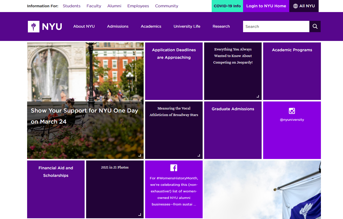
Source: New York University
Rely on Whitespace and a Clean Design
Whitespace can elevate your school’s web design and give your website a more open and modern look. It can also be used strategically to frame key text or spotlight specific calls-to-action (CTAs). With whitespace, users can more easily browse and scan your website—resulting in a pleasant overall user experience.
Here, you can consider both macro and micro space. The former refers to large areas of whitespace, typically separating design elements and providing visual clues on functionality. This can include padding and margins as well as space between text and graphics. The latter describes space between smaller elements, such as letters, icons, forms, buttons, etc.
The example below shows how Hult International Business School uses whitespace to visually group different content and add breathability to its web design. This makes it easy for prospects to quickly analyze the hierarchical structure and function of each section on the page:
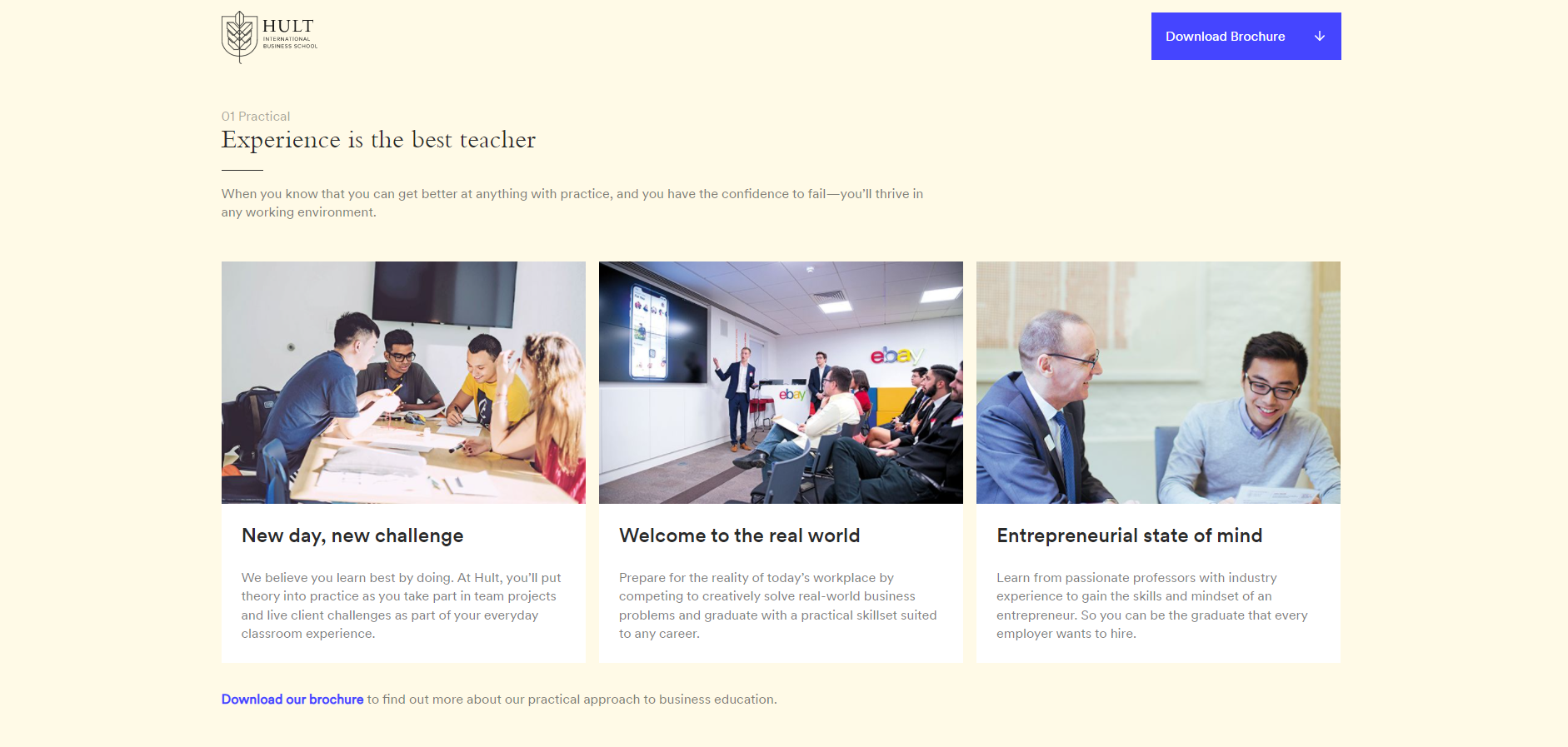
Source: Hult International Business School
Integrate Compelling CTAs
Including CTAs in your school’s website is part of higher education website best practices, especially as they indicate specific actions that help prospects progress to the next step of their journey. When used right, compelling CTAs can help your school direct prospects to take desired actions that push them further along the enrolment funnel—allowing them to discover new programs, services, or other relevant offerings.
CTAs should always be clear and relevant to the content you’re linking to. This gives prospects an idea of where they’re going in addition to motivating them to click in the first place. Great UX design keeps this in mind, as you can see in the example below:


Source: McGill University
McGill University uses engaging CTAs that speak to different student personas, clearly appealing to their unique needs and interests. In addition to compelling copytext, the CTAs are well-framed by whitespace. The use of images and eye-catching graphics also make specific CTAs stand out more easily, drawing more attention to them (i.e. the main application CTA in the black rectangle).
Pro Tip: Incorporating personalized CTAs can take your efforts one step further. HubSpot research shows that these types of CTAs convert 202% better than basic CTAs—ones that remain the same for every visitor. That’s because personalized CTAs reflect the specific needs and interests of visitors, changing to adapt to where they are in their customer journey.
Include Contact Information
It may come as no surprise but prospects visiting your website are likely looking for ways to better connect with your school. Keeping your contact information accessible is a key factor in creating a positive user experience. Your school can do so by featuring its physical address, phone number, and email on the homepage or footer section of the website.
Example: The EC English homepage includes an interactive map to help prospects easily locate the school. In addition to including the Director’s name and specific contact information, prospects can easily reach out by clicking on various CTAs:
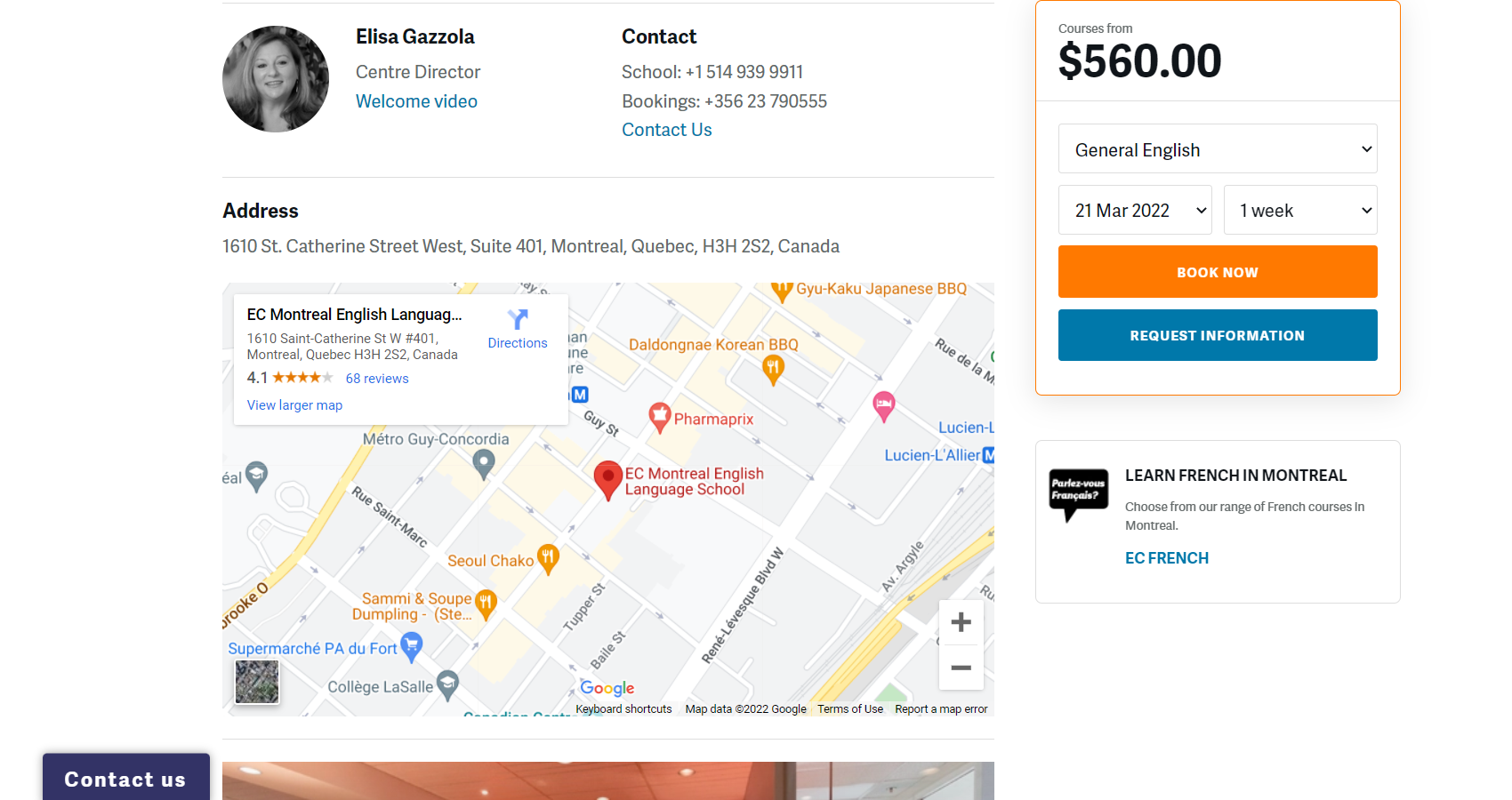
Source: EC English – Montreal
Pro Tip: Your school can turn contact info into clickable elements that can then be tracked via analytics tools, like Google Analytics. This can help you monitor key actions to optimize your site’s performance.
This may also be an opportunity for your school to consider conversational marketing by featuring a live chat or chatbot window. Doing so can boost engagement and allow users to quickly get the answers they need to general questions or concerns, creating convenient and pleasant user interactions.
Embrace a Simple Layout for a Better Website User Experience
When it comes to creating a positive UX design, your school will need to go beyond providing great content. “Besides the message being told,” Jason says, “what program or courses get a spotlight? How are they organized so the user can navigate and find what they are looking for faster, with fewer clicks?”
These questions can serve to direct your efforts, allowing your school to design a more successful user flow—the journey that a user takes on a website, starting with their entry point all the way through the final action. Here, each step must serve a purpose, leading to a meaningful destination on your site.
Schools enhancing their UX design can rely on journey maps to better understand their website’s flow and work towards addressing their prospects’ needs and concerns. In doing so, schools can combine user needs with website goals to create a unique and impactful website user experience.
Add Clear Navigation to Enhance Your School’s Website UX
Simple and clear navigation can prevent confusion, allowing prospects to easily find what they’re looking for. Schools wanting to highlight and encourage prospects to explore certain programs or services can use UX design to make the journey to those pages as easy and painless as possible. The goal is to limit the number of clicks as much as possible, accelerating the process.
Simple navigation should be a high priority for schools. Recent research shows that 38% of people look at website page layouts and navigational links during their first visit and 42% leave a website because of poor functionality. This makes accessibility more important than ever in today’s digital-first world.
Example: The University of Edinburgh uses a clear layout that facilitates ease of navigation. Prospects can rely on the main menu at the top of the page as well as the visual elements on the page to browse and navigate key links. This includes easy access to undergraduate and postgraduate degree programs (top of the fold):

It also includes access to various resources for campus visits, research insights, and contact information further down the page:

Source: The University of Edinburgh
Prioritize Your Mobile Users by Keeping Your Site Responsive
Unsurprisingly, mobile users generate a lot of online traffic. In fact, Statista reveals that mobile devices made up 54.4% of global website traffic in the last quarter of 2021. That’s over half of the world’s web traffic, making mobile responsive sites incredibly important.
A responsive school website ensures a streamlined and optimized user experience for prospects navigating your website on various devices, particularly those on mobile and tablets. This means they wouldn’t have to scroll sideways or enlarge sections of your site to read the copy text or click on a CTA. Instead, your school’s website would automatically adjust to your prospect’s screen and provide them with a smooth user experience.
Responsive design has been deemed so important that 53.8% of web designers believe it to be a top reason for a website redesign while 73.1% believe that a non-responsive site is a top reason why visitors leave.
The example below shows how Audencia Business School optimizes its website for different screens. The first image shows the homepage in desktop view while the following images show the same section of the homepage on a mobile screen. Here, we can see the adoption of a hamburger menu (top right) and stacked elements for easy scrolling:
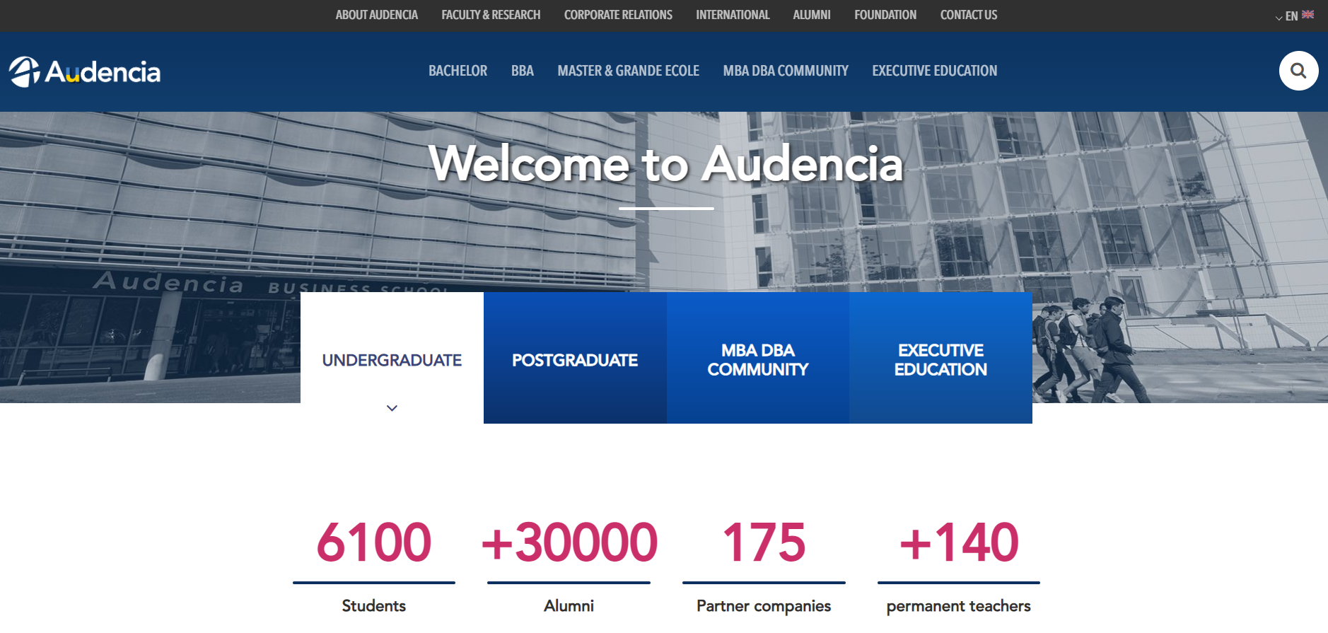


Source: Audencia Business School
Eliminate Heavy Page Elements and Plug-ins for Faster Site Speed
Schools with slow web pages risk losing visitors, especially since each second makes a big difference. According to Portent, web conversion rates decrease by an average of 4.42% with each extra second of load time. And so, slow loading speed can lead to a high bounce rate—the percentage of visitors that quickly leave after clicking on a landing page.
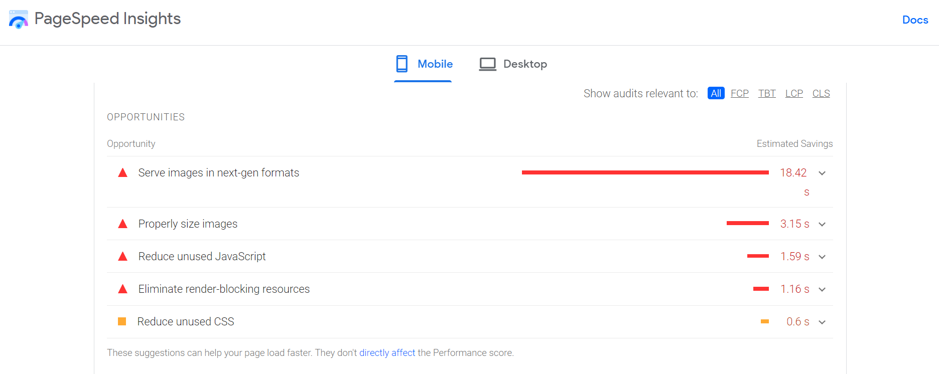
To help you reduce this number, your school can begin removing heavy elements from your site. This can be anything from heavy plug-ins to eye-catching visuals, like heavy animations and videos. It’s a good practice to check your site speed to ensure that everything is optimized for a positive user experience. For instance, Google’s Page Speed Insights tool can help you discover key insights that allow you to analyze your site’s performance and determine your next steps in addressing any obstacles for both desktop and mobile devices.
The image below shows Google’s Page Speed tool in action, highlighting opportunities that users can take to improve their overall site speed:
Source: Google Page Speed Insights
Optimize Your Images for Even Better Results
Image optimization can be easily overlooked, but it shouldn’t be. By optimizing your images, you can use eye-catching visuals that don’t bog down your website, allowing prospects to enjoy your content without any issues. Doing so, by default, allows you to improve your higher education website user experience.
Key tips you’ll want to consider include:
- Resizing images while choosing the right compression rate to avoid poor quality
- Pick the right image file and format
- Try out different image optimization tools or Content Management System (CMS) plug-ins
- Test optimized images for success
Conduct a UI/UX Audit to Ensure Higher Education Website Best Practices
As you design your school’s website, you’re likely to come across various questions regarding your content and how best to present it. A UI/UX audit can help your school quickly identify any shortcomings and areas of improvement, enabling you to direct your resources and efforts to where they are needed most.
With these necessary insights, your school can begin to “develop a game plan to implement these changes,” adds Jason. This, in turn, can improve your ROI—strengthening your reach with your target personas and boosting your overall student recruitment strategy.
By prioritizing your website’s UI/UX performance, you can learn how to optimize your website to increase conversions and apply effective SEO tactics to drive better results. Ultimately, you gain practical insights that can help your school improve its user interactions and appeal more to its prospects.


