Calls to action (CTAs) are critical elements within your website. They drive visitor flow, goals, and convert forms. If you do them well your website will be easier to navigate and will get improved results from your general content and offers. Ultimately good CTAs will increase your website interaction and drive your business outcomes. This post will offer 5 key characteristics of great CTAs and provide lots of examples from college and university websites to highlight how these principles can be applied.
What is a Call To Action?
There are two general implementations of CTAs, including:
- The Form CTA – CTA that is associated with some kind of form for example, lead generation, program registration, or events forms, that when clicked, “converts” the form and captures the submitted information.

- The Click-Thru CTA – a web page CTA used to capture a visitor’s attention and to lead them to another page of described content. These can be implemented in a variety of forms, including buttons, lines of text or graphics. They often include arrows (as below) or underlining to indicate to the visitor that these are active links.

Why are Calls To Action so Important?
The effectiveness of your CTAs will affect the quality of your site visitor’s user experience and will have a significant effect on the results you achieve from your forms. Here is an example from Marketing Experiments that shows the effect of text variations in a CTA on a common landing page on the form’s conversion rates . In this example conversion rates increased by 50% as a result of using a different text in the CTA. Your results will vary widely so your need to invest in developing your knowledge and develop the skills to produce high preforming CTAs. So what makes a good CTA?
Here are 5 things to think about that will dramatically affect the quality and conversion rates of your CTAs:
1 – Good Design : Shape, Colour, Clarity and Contrast
There has been lots of research and reporting on the elements that that produce good CTA results. Here is a link to one summary article that I think is particularly helpful. Shape and colour of buttons is critical to effectiveness. “Best Practices” will lead you towards the characteristics that generally produce the best results but because design is so subjective and contextual, the best results cannot be predicted for your CTA without testing. We will come back to talk more about testing at the end of this post.
The universal elements of good design apply to CTAs but I believe as seen below, the key is that simple, clear and high-contrast text, (and text encapsulation) will win the day.

![]() Centre College http://www.centre.edu/
Centre College http://www.centre.edu/
This search button is a great example of going that extra Mile on the CTA (the search button) to incorporate the visitor’s intent and state of mind in your CTA to motivate the click.
California State University, channel Islands – http://www.csuci.edu/
2 Context and Relevance
Of course CTAs do not operate in isolation. The must fit into a larger design and flow of information in a way that makes sense and works in combination with it. This example below shows how a CTA can be made to fit, conceptually and visually, into the context of a more general recruitment page.
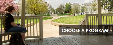 Macomb Community College http://www.macomb.edu/future-students/index.html
I particularly like this simple CTA from the University of Notre Dame that leads visitors off to an image library for the campus. It is clear, relevant and highly appropriate to the prospective student early in their search, providing a pathway deeper into the recruitment process, ideally leading to a campus visit.
 University of Notre Dame https://www.nd.edu/
 Texas Wesleyen University https://txwes.edu/admissions/
This series of click thru CTAs from Michigan State provide a really effective means to access different information for different individuals while at the same time implying to the prospective student the next steps that they will experience.
 Michigan state university international admissions http://admissions.msu.edu/admission/international.asp
This CTA example, combining image and text, provides the “new” student with clear wayfinding signals, as well as an image with which to self-identify
 South Texas College http://www.southtexascollege.edu/
The recruiting of international students is of growing priority to many institutions. The two simple calls to action to French and Spanish speakers below to “find out more” are highly effective in context of a larger international recruitment page.
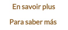 Paul Smith’s College http://www.paulsmiths.edu/
3 Bring Your Creativity
Bringing some creativity to your CTAs seems pretty obvious but I am guessing that a lot of the time web developers don’t have a lot left it left by the time they get to CTAs. That is the only explaniation I can come up with for some many examples of the dreaded “submit” or “click here to..” button. The three examples below provide engaging and effective hooks to draw visitors in. Who can resist “Celebrate with us” or “Explore Virtually”?
 Loomis Chaffee School http://www.loomischaffee.org/
Loyola U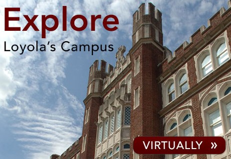 niversity of new Orleans http://apply.loyno.edu/
This is one of my most favourite CTA structures, from Paul Smith College. The buttons and text are so very simple but convey so much more than the average “Contact admissions” or “Schedule a Visit” buttons. And the “Ready for this?” is such a gentle, but playfully challenging lead into them, it is almost irresistible.
 Paul Smith’s College http://www.paulsmiths.edu/
4 Bring Some Urgency
Let’s face it, you need to get your CTAs to work on a timely basis to feed your admissions cycle. Bringing urgency to them can be effected in a number of ways. Simply adding a date, as in this example, communicates the timing and engages the visitor’s sense of timing quite directly.
 St John’s University http://www.stjohns.edu/
This example takes it one step further, providing the date and the very direct encouragement to “Book Now”. These “salesy” elements, although a bit too strong for some, are effective. Hundreds of years of direct marketing have proven that.
 University of Hertfordshire http://www.herts.ac.uk/
Here’s an even more direct challenge to act in a California State University CTA. In the right context this kind of encouragement fits, and on this page I think it works quite well.
 California State University, Channel Islands – http://www.csuci.edu/
5 Incorporate Value into your CTA
This is one of the most important factors in the success of a CTA but is so often forgotten or missed. How many people want to “Submit “ to anything. Isn’t “Get Started” a much more appealing and compelling action to most people. It’s not always easy to find just the right words but many of the examples provided here give the visitor that extra incentive to click by getting something of value in the process. If it is not possible to convey the value statement on a button or in a short sentence, try embedding the value proposition in text surrounding the CTA.
Loughborough University http://www.lboro.ac.uk/
 University of Reading http://www.reading.ac.uk/
 Ogden-weber tech college http://www.owatc.edu/
 South Texas College http://www.southtexascollege.edu/
The Secret to Improving your CTAs
This post has generally described a number of practices that can help you design your CTAs for more effectiveness but there really is no single formula for success that will work in every instance. That’s because every situation, every school, every value proposition is a little bit different, being applied in a different context to potentially different prospective student personas. So is there a secret to success?
Yes, The secret is testing. Use best practices to create the best CTAs you can come up with, implement them and then A/B test them. Come up with an hypotheses to explain why your winning CTA approach worked and test it again, and act on those results. Continue to repeat this process and your conversion rates will gradually improve and you will learn a lot about what works and does not work for you audience
We hope some of these idea will help you improve your CTAs. Please let us know what CTAs have worked best in your experience and what your all-time favourites are. We will add them into comments to provide more examples and inspiration to all!


