Various marketing efforts can be put in place to attract and engage prospective students. However, it’s your calls to action (CTAs) that actually drive conversions. If you’re thinking, what is a call to action? Then it’s best to think of them as prompts that encourage an immediate response or sale. For schools, an effective call to action can result in more student applications and enrollments.
With so many schools competing for the same prospects, cultivating compelling CTAs becomes essential. You can then use these CTAs across your school’s digital marketing initiatives—making them a key aspect of your school’s email newsletters, landing pages, website, and digital forms. This way, you can better encourage your prospects to engage with your brand, reach out for information, apply for a program, or even subscribe to your YouTube channel.
Here’s a breakdown of the different elements that make CTAs impactful, along with examples to showcase how these techniques are applied in CTAs across different digital marketing channels.
Draw In Students with Action Words in an Effective Call to Action
Wondering what a CTA is in education marketing? At its very core, it’s a prompt that motivates students to take action. Because of this, you’ll want to start with action when drafting your CTA text. A good strategy is to use clear and direct language with words that encourage prospects to fulfill a specific action. Some of the most common verbs used in education-oriented calls to action include:
- Apply
- Start
- Download
- Explore
- Learn
- Join
Well-crafted CTAs avoid confusion, and using action words can help. That’s because action words can be a way for you to distill your message to what prospects need to focus on most, enabling you to get the conversions you need. It’s important to make your CTAs short and simple, with text ranging from 90 to 120 characters—around five to seven words.
Example: On its homepage, the University of Reading includes a range of unique CTAs that begin with action words. The text is short and direct, giving prospects an idea of what to expect while urging them to complete each action. By clicking on these CTAs, prospects can engage further with the brand and its content.

Source: University of Reading
Aim to Encourage Curiosity and Create a Sense of Urgency
Your school should also focus on eliciting an emotional response with an effective call to action, prompting prospects to take action. The emotion you generate can stem from your efforts to encourage curiosity and create a sense of urgency. Prospects who are more invested in your message and curious about your offer will more likely convert.
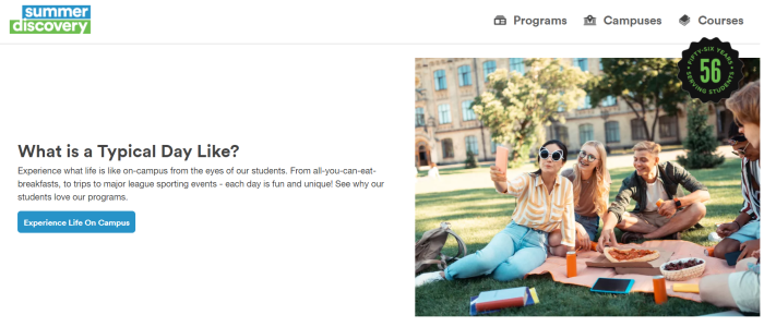
Example: On Summer Discovery’s homepage, prospects can explore content and learn more about the distinguishing features of available programs. To generate curiosity, Summer Discovery uses CTAs that motivate prospects to delve deeper:

Source: Summer Discovery
In the first image, the CTA can attract students specifically looking to explore the student experience. By inviting prospects to “Experience Life On Campus,” Summer Discovery can spark their curiosity and entice them to learn more about what they can expect from the program. In the second image, the text promises to help prospects find the perfect campus. This can naturally draw in curious prospects who are wondering which campus is the best fit for them.
Creating a sense of urgency may prompt prospects to complete an action more quickly in order not to miss out on your school’s offer. For this to work, you can incorporate time-related language. Effective call to action phrases that use this tactic can include some of the following words:
- Don’t miss out
- Last chance
- Hurry
- Now
- Limited time
- Today only
To promote its Open Days, The University of Cambridge sent an email to newsletter subscribers. Adding the word “Now” in the CTA more urgently pushes prospects to take action and register for the event.

Source: University of Cambridge
Taking a similar approach, the Toronto Film School uses urgency in the subject line of its email. The CTA incorporates the words “very last chance” to urge prospects who haven’t registered yet for the program to do so—or miss out.

Source: Toronto Film School
By using these phrases, your school can also cultivate a sense of exclusivity. Phrases like “subscribers only” or “limited spots available” can help motivate your prospects to sign up more quickly. They can even be used in your school’s newsletter to generate leads as well as enrollments.
Pro Tip: Remember to make the text in your CTA large enough to be easily noticed but not too large that it distracts from your overall message. Ensuring that your CTA is legible is important, but that should not come at the expense of your other content. It’s also helpful to personalize your text and use user-focused language, such as second-person pronouns. This can enable you to better engage your prospects.
Connect with Your Prospective Students through Dynamic CTAs
Dynamic content is known to have many benefits, giving you the ability to target different audiences more effectively through personalized content. By using dynamic content, you can create smart CTAs, essentially calls to action that adapt to visitors depending on the factors you’ve decided to focus on. This can be their location, browser language, or whether or not they are existing leads.
According to HubSpot, personalized CTAs perform 202% better than default ones. Choosing smart CTAs can help you create messages and prompts that truly resonate with your target audience. This can be particularly helpful for schools with different student personas, including local and international students.
Integrate Your School’s Value Proposition in an Effective Call to Action
Schools wondering how to write an effective call to action can turn to their value proposition and craft a compelling prompt. In such a competitive digital space, schools need to communicate the standout features that make their services and programs worth exploring. This way, prospects can get a sense of what they can gain by moving to the next step of the student journey—allowing them to anticipate specific benefits that can ultimately help them make a more informed decision.
There are various value propositions that you may want to consider depending on the offer you’re hoping that prospects would click on. For instance, if your school is offering a one-on-one counseling session with school advisors, then you’ll want to emphasize that it’s a personal session. Similarly, if you offer a free guide, you can highlight the value you’re offering by urging prospects to “download your free guide.” The same applies to virtual tours and other unique offers made by your school.
Cumberland College takes this approach in its email newsletters. Towards the end of the email, the school has a dedicated section centered on a CTA that urges prospects to “Schedule a Personal Info Session.” This can attract prospects who want to engage more directly with the school, clearly highlighting the value they can gain from setting up a meeting. By clicking on the button below, they can begin to reap the benefits.

Source: Cumberland College
On the Academics page of its website, Stanford University highlights the fact that it has seven schools on a single campus. Instead of writing generic text, the University chooses to emphasize this in their CTA:

Source: Stanford University
These call to action examples in education can be a source of inspiration, helping you determine how you can showcase your unique value proposition in CTAs across different digital marketing channels. The key is to focus on factors that distinguish your school from its competition and enable you to better catch your prospect’s eye.
If you’re looking for ways to identify your value proposition and improve your inbound marketing strategy, then our team of industry experts can help. Reach out to get custom-tailored insights to boost your student recruitment efforts!
Create a Captivating CTA with a Modern Design
In addition to compelling text, an effective call to action has to be visually appealing in order to attract your school’s target audience. This is where good design comes in. Generally speaking, modern websites embrace a clean look with lots of white space and a limited colour palette. This can also apply to CTAs. However, in both cases, you’ll want to ensure that the colours and the overall aesthetic match the school’s branding.
A good starting point is to focus on contrast and legibility. The colours you choose for your CTA should be easy to read. If your text is housed in a box, then it should be comfortably laid in the center—not too close to any of the edges. This provides extra breathing room to help boost legibility, all while promoting a clean design.
Example: The University of Sydney’s website follows these guidelines, with the homepage adopting a clean and modern aesthetic. Similarly, CTAs match the existing branding—incorporating contrasting colours and white space to make them more visually enticing.
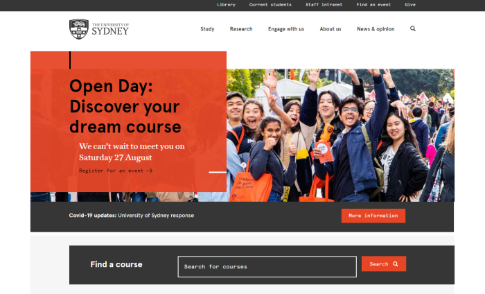
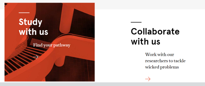
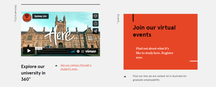
It should be noted that engaging text is added to these CTAs to make them more personal. The use of arrows is also repeated throughout the page, creating a consistent pattern that goes well with other elements on the page (such as the line separators), as seen below:
Source: The University of Sydney
Throughout these examples, the University maintains a consistent brand with a limited colour palette and an inviting aesthetic. These examples of CTAs for education showcase how schools can present key actions in a simple yet visually engaging way to drive student conversions.
Establish Visual Hierarchy in an Effective Call to Action
Often, websites have more than one clickable button. To create a hierarchy, you’ll want to make a clear distinction between regular hyperlinks and the main CTA you want your prospects to focus on. In doing so, you’ll create primary, secondary, and potentially tertiary buttons.
For instance, your main call to action for education can be a primary button with an eye-catching design, and your second – less important action – can be in grayscale or monochromatic. Your third action may then appear as hyperlinked text. Taking these steps can help you visually communicate which actions are most important and which ones can fade into the background. This way, your prospect can immediately zero in on the action you want them to take, like applying to a program or contacting your team.
In the example below from the University of Windsor, there are two CTA buttons that prospects can focus on. Although they’re positioned side by side, the “Apply” CTA is more distinguished—given a colour that makes it pop out of the background. This distinction transforms that button into a primary one. In contrast, the “Program” button is less eye-catching and provides a secondary action.

Source: University of Windsor
EC English uses another method to distinguish between different actions. On its homepage, the school has two main buttons, each set in a different colour. The first adopts a more eye-catching orange that’s closer to the school’s own branded colour, while the second is a much cooler blue. It’s more likely that prospects will notice the orange “Book Now” CTA first, making it more impactful.

Source: EC English
Pro Tip: While there may be many CTAs on a school’s website, it’s best to limit that number in a school newsletter. In fact, research shows that emails with a single CTA can receive 371% more clicks than those with multiple CTAs. When incorporating CTA buttons in your email, be sure to make them legible and consistent with your school’s branding.
Consider Your School’s User Flow and Student Journey when Placing CTAs
An effective call to action needs to be at the right place at the right time. For this to happen, you need to determine what you want your CTA to accomplish and who it will be targeting. With this information, you can improve your student recruitment strategy and create a more pleasant user experience for prospects navigating your website.
It’s important to align your CTAs with what the user may expect. Here, the goal is to prevent them from backtracking and give them everything they need to move to the next stage of the enrollment funnel. This is where you’ll want to consider the user flow on your school website and strategically place your CTAs.
The user flow is the path your school creates to move prospects through conversion funnels and towards enrollment. CTAs in each step need to integrate your school’s business objectives as well as your students’ goals. For example, if prospects have just landed on your homepage, then your CTAs should pinpoint them to the information they need or want to explore—pushing them to engage further with your school.
Example: On the Future Students page of the Bishop’s University website, students can read all about the benefits of attending the school and the student experience. To entice prospects to learn more, Bishop’s University uses a CTA at the end of the text—linking to an Inquiry Form:

Source: Bishop’s University
The text “Tell me more about BU” may prompt prospects to explore what else the school has to offer. Prospects already seeking to learn more may be more inclined to convert since the message aligns with their goal.
Different types of content will likely require different CTA placement strategies. For landing pages, you’ll want your CTAs to be at the top—ideally above the fold. In blog posts, the CTA can come after the content. Your school’s CTAs can also be placed on the sidebar of your website, within the content via a callout box, or even in types of embedded media (like videos). The key is to put them where they count and not where they create a distraction or inconvenience your prospects.
Example: In their blog post, Business School of Lausanne adds a CTA towards the end. The CTA also incorporates hyperlinked keywords, making it even more effective:

Source: Business School Lausanne
Example: The London Business School uses different types of CTAs in a single program page. At the top, prospects are prompted to watch a program video, download a brochure, and apply to the program. Scrolling further down, they encounter CTAs that align with the consideration stage of the student journey—inviting prospects to dive into the program outline and determine if it’s the right one for them.
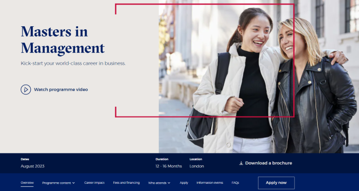

Source: London Business School
Scrolling even further, prospects discover other CTAs that push them closer to making a decision. In a callout box, the school encourages prospects to download a program-centric employment report (primary CTA) and discover what career benefits they can gain from the program (secondary CTA):

The strategic placement of these goal-specific CTAs urges prospects to engage with the school and consider the program more deeply. Each CTA serves to push prospects closer to enrollment, giving them the exact information they need in a logical and natural progression. Optimizing your CTAs in this way can ultimately enhance your school’s student recruitment strategy.
Bonus: Conduct Tests to Determine Your School’s Most Effective Call to Action
Taking the right measures can help you maximize your CTAs and generate the best results. However, determining whether or not you’ve got everything set up as best as possible can be a bit tricky. To help your school make the most of its efforts, consider conducting A/B tests. According to research, 60% of companies find A/B testing to be highly valuable for conversion optimization.
Through A/B testing, you can compare different versions of your CTA by changing a single variable and showing each version to a similarly sized audience over a specific period of time. The results should help you identify which element produces better results, giving you the insights you need to create an effective call to action that works best for your school and its audience.
You can test different components of a CTA, including the text, design, and placement. Going through this process ensures that the final result is a high-performing CTA that drives student conversions.


