A good college or university website makes it easy for visitors to accomplish their goals by making navigation intuitive, eliminating clutter, and featuring effective visual and written content that illuminates a clear path to desired action. But to convert your online traffic from passive visitors to engaged participants that submit applications, information forms and donation pledges, you have to convince them to click your links with a call to action (CTA). Aptly named, a call to action is supposed to inspire and enthrall – to convince the website visitor that they should hop to it and take action, not just sit there idly. A compelling call to action triggers additional meaningful engagement, transforming a prospective student into a student that’s ready and willing to sign up. Your blog post or your landing page is what makes a great case for your product or service, but in the end, it’s the call to action that will push people to take the next step.
The ABC’s of sales refers to “Always Be Closing,” which in web design strategy translates to always keep a call to action visible for the prospect who is ready to convert. Repeating calls to action throughout several pages on your website serves as a persistent reminder so that when your copy has finally convinced the prospect, they know where to go. Although there are some definite best practices regarding placement, phrasing and design of CTAs, it is always recommended to experiment with, track and measure various combinations – the results may surprise you!
Positioning your CTA
Although conventional wisdom dictates that a CTA appear on the top-right of the page, “above the fold” where your visitors are most likely to see it, many companies have found that moving their CTA to the bottom of the page actually contributed to a significant conversion increase. Even if only 20% of people read below the fold, as David Ogilvy’s famous 1960s advertising research noted, those who are really interested in your content may only be ready to click on your CTA after scrolling down and digesting the whole page. Ogilvy observed, “Research shows that readership falls off very rapidly up to 50 words of copy, but drops very little between 50 and 500 words.”
Just as importantly, you should be aware of when it’s not a good idea to use a call to action. Calls to action are meant for very specific pages that are designed to inform a prospective lead, and guide them down a path that results in them taking action, and hopefully taking you up on your offer of a product or service. It’s not going to do you any good to place calls to action on every page, because it can overwhelm visitors who feel like you’re pushing too hard, and it can also become confusing if every page you have is trying to convert visitors with a call to action. Some of your college content marketing should simply inform, because calls to action work much more efficiently with a tight, guided copy and on a page that’s specifically tailored to convert.
Position your CTA where the prospect is most likely to be motivated to take action, or if in doubt, have one available whenever sufficient context has been provided for prospects to take the next step. In general, positioning the CTA lower works best when an informed decision requires digesting a lot of information, but for more easily understood propositions, keep it higher on the page.
Example: Dalhousie University features its four primary calls to action on each pane of its revolving home page with different introductions depending on the accompanying image, such as: “Hands-on learning: go ahead and test the waters.” On the interior pages, they expand upon these key desired actions with additional links, text and images.


Wording is Key
Knowing how to phrase your call to action and when and where to use it can really make a difference in turning prospective students into enrolled students. Just as with the wording of a blog post or a landing page, choosing the right verbs and ensuring that your statement is clear, specific, action-oriented and enticing will impact your conversion rates. All landing pages have a submit button but the default text of “submit” can sound, however subconsciously, like a rather unappetizing commitment. Such commands were more successful in the web’s early days but today’s student recruitment demand a more sophisticated approach. Dan Zarrella at HubSpot compared the conversion rates of over 40,000 landing pages and found that buttons that implied a lower investment of time and effort performed better.

Your call to action should come off as a logical conclusion to the text that’s supporting it, not stick out like a desperate sore thumb. “Click Here” or “Go” proved to perform better if the supporting text makes a convincing case, or even better, try using wording that restates the value of clicking the button from the prospect’s perspective like “Give me my free information” or “Let’s Get Started!”
When crafting your CTA, carefully consider your target audience – their interests, language and primary incentives for taking the next step. Although surrounding graphics or use of space can greatly strengthen your message, a quick scan of a webpage will naturally focus in on the CTAs text, so the CTAs value should be readily apparent without having to read the fine print. Clicking a CTA is an expression of trust, so a more unobtrusive appeal like Basecamp’s “Give Basecamp a try – it’s free for 60 days” works because it is specific, the benefits are clear and by clicking the button it would seem there’s nothing to lose. This CTA is repeated three times as the visitor scrolls down their home page and is emphasized by its context, which we’ll discuss next.

Context, not Confusion
The effectiveness of your CTA depends largely on the context of the web page, which will influence your colour choice for the CTA button and text. To make it stand out, select colours that contrast with the background while still fitting in with your general website colour scheme. Warm colours like orange or yellow can make your button pop out to your prospect, particularly when the background features colder colours like blue, and designing your button to appear more three-dimensional will also make it more clickable. Keep in mind that if you’re using images for CTAs in emails, up to half of your subscribers may not be getting them because they have images turned off in their applications. Instead, use HTML and CSS code for the CTA button to create the shape, colours, border, shadow, etc. to ensure it is displayed. There are several online resources available for this, such as litmus.
The above example from Basecamp demonstrates the power of leaving lots of white space around your CTAs, letting them breathe and making it easy for prospects to find them. Even busy web pages with distracting elements need to keep the CTA section clear enough to attract attention. University of Alberta features bright yellow “Apply Now” CTAs frequently throughout their site, standing out while staying true to their school’s colours. The bold font and arrow in the design add to the intuitive appeal. Notice how they have prioritized the first of two CTAs by adding the distinctive yellow.

If you’re using a call to action like “Download Our App,” it should come after a thorough explanation and justification of the great features your app has, not just out of nowhere. A call to action without context defeats the purpose, because people won’t even be aware of what you’re trying to offer them, much less be interested in taking you up on it. It’s hard to get someone to “Request More Information Today,” if you haven’t already given them enough information to interest them. A call to action should be a logical conclusion to a page, not an outlier on it. Present relevant incentives whenever possible to sweeten the pot, such as what the prospect stands to gain from clicking your button. Some of the more compelling CTAs emphasize that the offer is free or signing up takes only a minute. Social proof, such as social media stats, the number of existing subscribers or student testimonials increase legitimacy, as does placing a link to your privacy policy below your CTA, if applicable. If the CTA is to download an app, consider showing an image of a sample screenshot to connect the action to result.
Example: John Cabot University’s study abroad program page ends with two very direct and contextual calls to action. After a thorough explanation of what sets their program apart from others and makes it so unique, they follow it up with two logical calls to action – one that’s intended to convert their interest into an application, and one to get them to download the app so that the school stays on their radar. Clicking on the app option brings visitors to a new landing page offering screenshots and a description.

Use the Technological Tools at your Disposal
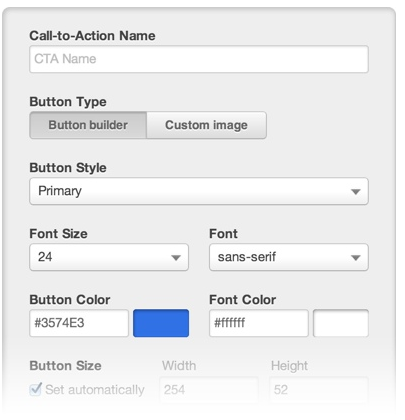
Thankfully you’re not all on your own when it comes to integrating great calls to action into your blog posts or landing pages. Using a tool like HubSpot is a great way to quickly implement a variety of call to action campaigns that are easily customizable, dynamic and measurable. “Smart CTAs” show different content dependent on the pre-established student persona (based on variables such as program, location or interests) or lifecycle (i.e. new lead, accepted, current student, etc.).

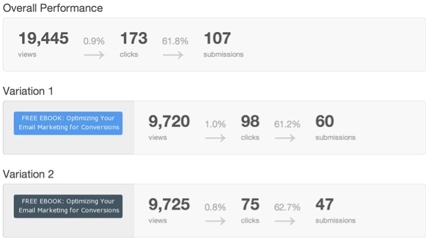
We will discuss the intricacies of A/B testing further in our next blog, but essentially you can and should be testing everything and regularly repeating the process. You might try placing your CTA in your content body as a hyperlink instead of a button or banner, changing the button or text colour and size, and infinite text variations. Even minor adjustments can drastically alter conversion rates.

Always be testing various elements on your website using higher education Analytics to see if slight changes can make for significant improvements in conversion. Remember that no CTA exists in isolation – each landing page should point towards the path to completion and clicking the button needs to deliver on the promise you’ve worked so hard to craft.

Have you found any surprising results from making small changes to your calls to action?


