


Mobilegeddon descended upon us on April 21st, striking fear into the hearts of education institutions whose websites are not yet optimized for mobile. Google’s new algorithm is designed to favor responsive and mobile-friendly websites, helping them rise to the top of search engine results pages. On the other hand, websites not yet optimized for mobile will take a hit in results rankings, penalized for making mobile browsing less accessible for Google users. Thus far, the changes apply only to smartphones (and not to tablets).
Wondering what constitutes mobile-friendly? Here is Google’s main criteria for a responsive website:
- Avoids software that is not common on mobile devices, such as Flash
- Uses text that is readable without zooming
- Content is sized effectively to the screen so no horizontal scrolling/zooming is required
- Features links that are easy to tap
Many Schools are Behind the Mobile Curve
Given the growing importance mobile optimization for education lead generation, it’s really surprising how many schools, programs and universities have not yet embraced responsive or mobile-friendly design. As of just last year, over half of the colleges and universities in Canada had non-mobile friendly main websites:
 source
And yet, Google’s recent Educational Search Analysis Report reveals that across the total higher education search market, mobile-based queries have increased by 23 per cent.

And, according to research by World Education News and Reviews (WENR) international millennials are more likely than ever to perform education-related searches on mobile devices. More than half of the surveyed international students (56 per cent) use a smartphone in addition to their desktop computer to research schools and programs.
What We’ve Noticed About Mobile Traffic
Tracking this trend ourselves over the past couple of years, we’ve observed a significant spike in mobile (smartphone) traffic to our clients’ websites – in some cases as much as 20-25 per cent. And conversions from mobile are also on the rise. Prospective students are increasingly likely to perform typical conversion tasks, like request info, download an application form, or chat with an adviser, from their smartphone.
Here’s an example from one of our clients showing 22 per cent traffic – and 25 per cent conversions – all coming from mobile:

How Education Marketers Can Capitalize on Mobilegeddon
Mobilegeddon isn’t really a disaster; it’s an opportunity. Since so many schools and programs have not yet made their main websites mobile-friendly, space has opened up on the search results page for those who have invested in optimization. And if your institution has not yet taken the plunge?
Here are five simple tips we recommend for attracting increasingly mobile-oriented students – and boosting your visibility on Google.
Prioritize an Easy-Read Mobile Design
Uncluttered organization is an important feature of mobile-friendly design. When prospective students arrive at your website using a smartphone, they should encounter a streamlined, easy-to-read format that features the following elements:
- Selective primary content
- Vertical navigation vs horizontal
- Minimal graphics and footers
- Limited in-page links
Here’s a good example from Southern New Hampshire University:

Prioritize Functionality to Better Engage Prospective Students
It’s critical to ensure that prospective students will be able to take ‘next steps’ with ease when visiting your school’s website via a mobile device. They should be able to identify and access campus locations, program information, applications forms, contact information, etc. without coming up against any “unfriendly” roadblocks.
Here are a few functionality elements to consider when designing for mobile:
- Geo-specific features & functions
- Integration with phone functions for one-tap calling options
- Enlarged interface element for larger hands and fingers
Here’s an illustrative example from Hunter Business School:

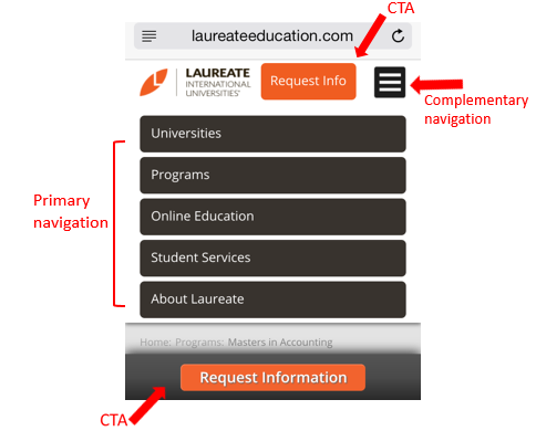
Customize Your Content to Promote Conversion
Content customization is a crucial component of effective student recruitment via mobile devices. Since screen size is limited, schools should consider which elements their personas are most intent on engaging with and put those front and center.
For K-12 schools who target parents as decision-makers, it might be wise to feature links like “Academic Excellence” and “Extracurricular Programs” right on your mobile site homepage. ESL schools who recruit mainly from overseas will probably want to feature an “International Students” link on their mobile homepage. This strategy increases your chances of capturing the visitor’s interest – and converting it to an inquiry with a well-placed CTA.
In this example, we see strategically selected links, prominently placed CTAs, and an option for complementary navigation in the top right corner:
Tools for Measuring Mobile Recruitment
Crafting an engaging, user-friendly, and persuasive mobile website is an excellent start to coming out on top after Mobilegeddon. However, without measurement strategies, you’ll be guessing at where to concentrate your efforts next. These tools are great for getting started:
- Google Analytics
- Google Webmaster Tools
- Gshift Labs: tracks rankings of SEO keywords on mobile devices
Google Analytics
In order to refine recruitment tactics, it’s necessary to understand from which channels the majority of your website’s mobile traffic is coming. In this example, we’re using Google Analytics to measure mobile traffic from Paid Search, Organic Search, Referral, Direct, and Social:

We can see that Paid Search is converting at a higher rate than the other channels; however, Organic Search represents nearly 60 per cent of Sessions and Goals. In our experience, education marketers tend to overlook the value of Organic Search in terms of its capacity to drive a high volume of traffic to their institution’s website. Organic represents a big opportunity to attract and convert prospective students on mobile.
GShift Labs
GShift Labs can help you track SEO keyword rankings on desktop versus mobile. When students and parents search for information about schools using a mobile device, Google will try to offer them the most relevant results based on their device and location.

The column in the middle, Google.ca, combines results from users all over the world who search using a range of devices, including desktop. The third column is geo-specific, and measures keyword rankings based on mobile users in Vancouver. The rows we’ve highlighted in yellow demonstrate just how different the results can be, and why it’s important to know where your institution ranks when prospective students perform searches with their smartphones.
Google Webmaster
Google Webmaster is a particularly insightful tool that is available free of charge to all education marketers. It can help your school or program segment search queries by mobile devices and location, and filter that traffic to see how many clicks your website is receiving.

Here is another way Google Webmaster can help you capture and analyze mobile performance by search query:

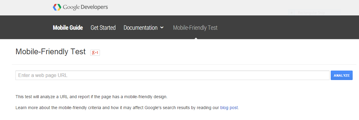
Test Your Website’s Mobile-Worthiness
Some institutions have already implemented some solutions for visits via smartphones – native mobile apps, for example. If you’re unsure whether your school’s website meets Google’s new criteria, try their free assessment tool – all you need to do is enter your institution’s URL and the tool will run a test to determine how mobile-friendly your site really is:
Have you noticed any changes in your school or program’s search results ranking since the onset of Mobilegeddon? We welcome you to share your experiences and observations in the comments section below.


