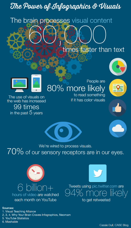
The overwhelming quantity of data that the internet has made available at our fingertips has had an interesting effect on the way we internalize information. As attention spans wane by the day, web surfers have become more adept at giving a quick scan to determine if a site is worth their time. Websites were once much more text-heavy, partially because bandwidths available at the time limited loading times of images and multimedia, but images are now all the rage in web design and social media trends. With the constant challenge of trying to communicate information to ever busier consumers, it is no surprise that infographics have become so popular. Integrating pictures, charts and diagrams to simplify and present complex information in engaging and informative ways, the use of infographics has exploded in the past few years.
 Source
Infographics have become an important component of content marketing strategy and development because its inherently data-rich visualization format makes for an easily understandable way to tell your story. Combining quick facts with colourful images gives viewers persuasive context, and information presented visually is more easily interpreted and remembered. It can be a particularly useful tool for colleges and universities, which typically have vast amounts of often complicated information to impart to diverse target audiences. The easily scanned infographic content has proven to be appealing to both teenagers and their parents. Marketing benefits include establishing brand awareness by integrating an unobtrusive logo, and demonstrating thought leadership by providing industry related research in an innovative manner. The engaging nature of infographics encourages social media sharing and even the potential for going viral, meaning valuable backlinks and SEO for colleges. If influential blogs and websites link to your infographic, your search engine rankings climb by virtue of this added proof of reputation.
The trendiness of infographics has inevitably inspired a glut of poorly designed, link-baiting creations that confuse more than inform with cluttered or irrelevant content lacking narrative cohesion. Infographics can no longer impress based on novelty value alone – competition for viral-worthy content is heating up all the time and therefore development and promotion must be strategic to be effective. Many infographics include statistics, graphically presented, but these must be presented in a logical narrative arc that show the meaning behind the data, including necessary details that place the numbers in context, even if they are in small print at the bottom.
 Source
Creating a Successful Infographic
The cost to create an engaging infographic may seem out of reach for a small college but there are actually many easy-to-use tools available on the net and perhaps even graphic design students on campus with the necessary skill set. Keep in mind that template programs might lose in their potential for unique interaction what they gain in cost and time savings. Choose a subject that resonates with your target audience and can be compellingly conveyed with statistics and illustrations, provoking insights from quickly demonstrating unexpected relationships between data over time or what it would have taken pages of text and tables to convey.
Infographics can be a powerful tool in your content marketing kit but they aren’t right for every situation. Overly complex information that requires extensive text could probably be better expressed with a blog. Blogs, meanwhile, can be a great source of infographic material – choose a popular one based on analytics results with the requisite timely, interesting content that can be convincingly adapted by your graphic designer. Find reliable and relevant data to tell your story and be extra creative with the design. Avoid overloading the senses by erring on the side of simplicity and clarity, but integrate contrasting colours to maximize eye-catching impact. Add a touch of humour with playful illustrations if it suits the subject and brand.
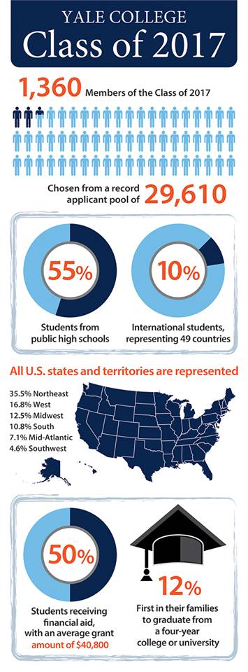
Example: Yale University recently promoted the selective and diverse nature of its Class of 2017, with interesting facts about the proportion of students receiving financial aid and more presented in a clear, easily digestible format. It was posted on their Admissions Office Tumblr.
Going Viral
The best place to host your infographic is likely your website blog, including an embed code to make it easier for viewers to share elsewhere, if that is your intention, established to show the infographic from your server with a link attributing it to you and back to your original post. SEO Gadget has a handy “embed code generator” to do the job. To gain more social attention, include a “Pin It” button, submit to an infographic directory like visual.ly and consider featuring it in a press release. Post the infographic to your social media channels, creating a call to action that encourages sharing. SlideShare allows you to share infographics from your LinkedIn profile page. Analyze which sites are sending you traffic by integrating Google Analytics on the blog post’s landing page.
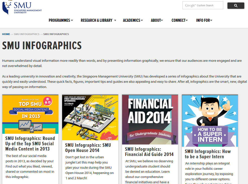
Example: Some higher ed websites, such as Singapore Management University, include a dedicated infographics landing page featuring guidance about important admissions information or other relevant content. Financial aid, study abroad programs, benefits of a specific degree program, or general admissions processes are some examples of potentially complex information that can be simplified through infographics.
In today’s competitive higher education market, it is increasingly important to take advantage of every digital tool available that can sell prospective students on the merits of your institution. Infographics have a unique capability to remove potential obstacles for understanding complicated information that may be overwhelming for high school students, such as financial aid, or to simplify decision making for fundraising and other purposes. They are ideal for visually exploring trends and statistics, as a quick reference for conveying an overall shift in a specific area. Many schools already use infographics in the classroom and continue to find suitable new subjects that benefit from the infographic treatment.
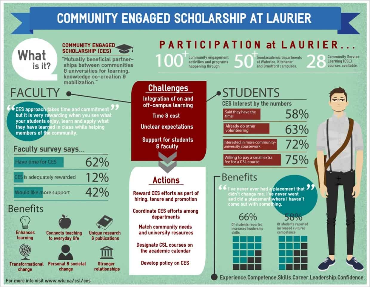
Example: Wilfrid Laurier University has developed an infographic to explain community engaged scholarship for mostly internal audiences. Like many infographics, there remains much time-consuming information to analyze but the surveys, quotations and statistics are persuasively presented to catalyze institutional change.
Creating an effective infographic requires a fine balance between word content and graphic design, which is easier said than done. Some of the most popular posts on our blog have been infographics, and there are significant content marketing pay-offs when they are done right. Set clear marketing goals to focus development and be sure to optimize data-driven digital tools to research, promote and measure the success of your initiatives.
What best practices does your school have for developing infographics, and which ones have been your most successful?


