


The QS 2016 report on digital marketing in higher education reveals some fascinating trends in how schools are re-tooling their online recruitment strategies this year. Specifically, the report looks at which digital channels education marketers plan to focus on most, covering institutions across Europe, North America, Asia, Oceania, Latin America, and Africa.
Despite their geographic diversity and varying recruitment goals, respondents agreed that this year, their schools’ website will be the most important factor in online recruitment (up three points in importance from 2015).
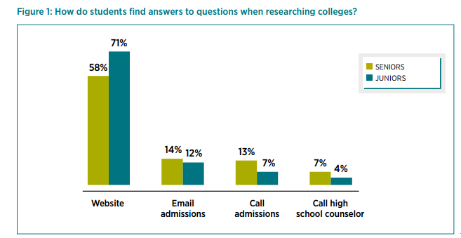
Other market research seems to agree that school websites remain pivotal during students’ post-secondary decision-making journey. According to the 2015 E-Expectations report from Ruffalo Noel Levitz, 80% of high school seniors say a college website shapes their overall perception of the institution.
And here’s a snapshot from the same report, showing where students go for answers while researching potential schools:
With evidence like this, it’s not surprising that the QS survey respondents have made website design and optimization a “leading priority for 2016,” outranking content marketing, social media, SEO, and email.

But this begs the question: what kinds of changes will schools be making to their websites to attract and engage more visitors?
What should savvy schools be looking to add, remove, or re-tool on their own websites to help generate more quality student inquiries?
Here are seven signs your website may be sabotaging your student recruitment – with a generous sampling of examples and suggestions for tightening your strategy going forward.
1. Your Website Doesn’t Reflect Your Personas’ Priorities
Quick, can you confidently answer these three questions?
1. What top 5 questions are your personas looking to get answered when they arrive at your website?
2. What 3 tasks will they want to complete first (download an academic course calendar, peruse your viewbook, book a campus tour, reach out directly to Admissions via phone or email, etc.)?
3. What is motivating your personas to seek out an education, and what is most likely to hold them back from enrolling?
The answers to these questions (and quite a few more) play a crucial role in creating a seamless and persuasive website user experience for your target audience.
Unfortunately, many school websites are structured around unconfirmed priorities administrators assume are most relevant to prospective students. And in some cases, site decisions are oriented around flashy new design trends that sacrifice basic usability for the promise of mass appeal.
But at this point, most education marketers know that mass appeal is firmly “out” and carefully researched personalization is the new star of student recruitment.
To successfully generate inquiries through their website, schools must thoroughly understand what drives decision-making for their target audiences – and ensure their website reflects those needs and goals.
The moment they arrive at your homepage, your visitors should see a path forward that seems tailor-made just for them.
Here’s a great example from Bates College, whose homepage makes crystal clear which segments are being targeted. New students, parents, and alumni know exactly which “door” to pass through here:

Navigation, usability, content – all should be considered from the vantage point of your targeted visitor. Your website must be able to “close the deal” by making it easy for users to find the resources, answers, and reassurance they need to take next steps toward enrollment.
The best way to achieve this goal is by researching your personas, tracking their behavior on your website, and ensuring top tasks are easy to complete.
2. You’re Missing Crucial “ROI Content”
More than ever, students and parents want reassurance that their educational investment will “pay off” after graduation. Their decisions about which school to attend, and which program to pursue, are considerably influenced by economic factors like affording tuition, avoiding debt, and finding work quickly after graduation.
The 2016 Princeton Review College Hopes and Worries survey found that cost and student debt were the top “worries” of college students and their parents. Meanwhile, landing a well-paying job ranked number one in the “hopes” category.
It should be no surprise that your website visitors want clear data on how many of your grads (from each program) go on to secure jobs in their fields right after graduation. Prospective students also want to know exactly how many alumni are currently pursuing post-graduate work, and at which universities. And they want information on how to minimize student debt, project their eventual earnings, secure financial aid, and much more.
Higher ed websites should showcase evidence-based ROI content that visitors can use to answer these pressing questions, without navigating away to a third party research portal.
Here are a few examples of schools who are getting it right.
1. Falmouth University reassures tentative applicants by prominently showcasing their impressive graduate employability rate on their homepage slider:

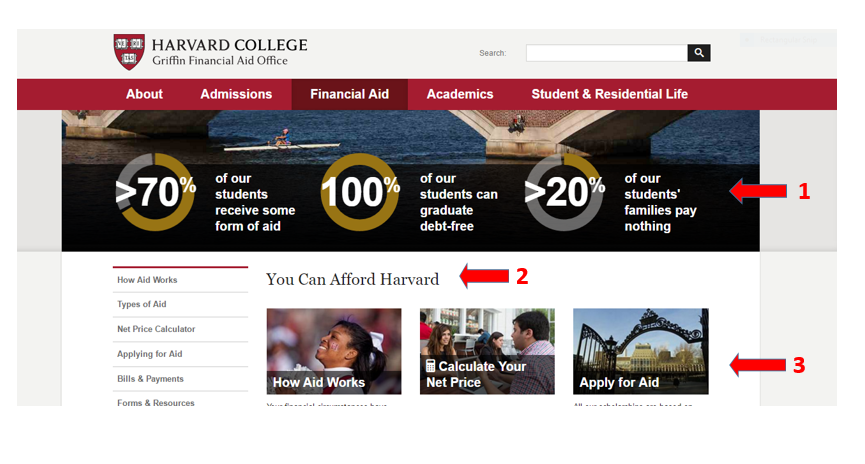
2. Harvard University proves to cost-conscious visitors that they “can afford Harvard”, and should go ahead and apply, by highlighting reassuring stats on their Financial Aid section:
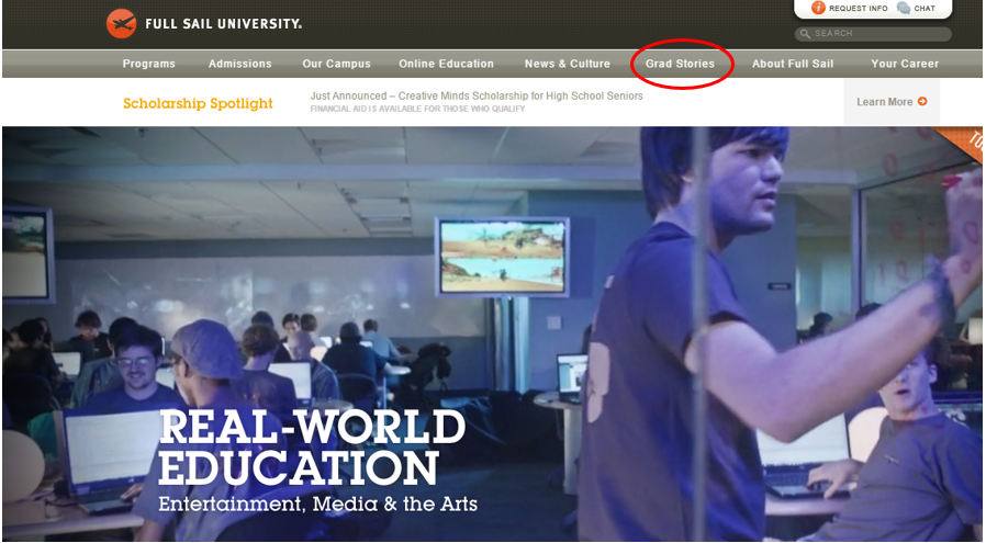
3. Full Sail University provides compelling evidence of successful grads by offering detailed accounts of their career success (for each and every program):
4. And finally, The University of Iowa lists detailed data on placement rates for each of its programs:

Does your website put ROI content front and center to reinforce the value of your educational programs? If not, you’re missing a valuable opportunity to resolve one of your personas’ greatest fears, earn their trust, and inspire next steps toward inquiry.
3. Your Faculty Is Invisible
Prospective students are naturally curious about who teaches at your institution. Even after they’ve enrolled, students will often consult one another (and notorious ‘rate my professor’ sites) about a particular instructor’s expertise and teaching style before committing to a course.
Once they’ve arrived at your website, visitors will definitely search your pages for a glimpse into your lecture halls and classrooms, video clips of class in session, photos and biographies of your faculty, and other evidence of what it’s really like to learn at your institution – and whom they’ll be learning from!
Surprisingly, many higher ed websites neglect to provide this transparency, even though showcasing professors can help build a reputable brand, add a human touch, and help draw website visitors into your school community.
Here are a few examples of how to make faculty more visible, starting with the University of Toronto who regularly features professors’ accomplishments on their homepage slider (as part of their News section):

Here’s another example of how to introduce your instructors with fun head shots and mini-bios, like the language school CultureWorks does here:

When you click on an instructor image, their mini-bio opens up:

There are myriad ways to introduce prospective students (and parents) to instructors on your website. If you’re looking for more discussion and examples on this topic, check out this previous blog post.
In the meantime, don’t leave students wondering who will be in charge of their education at your school.
Promote your professor’s accomplishments, share information about their background, research, and teaching approach, and include video clips of class in progress on your program pages. You will generate excitement around meeting and studying with your esteemed faculty, which in turn, will help build conversion momentum.
4. You Favor Text Over Visuals
We know that the human brain processes visuals 60,000 times faster than text. We know that visuals are expected to continue playing a crucial role in online marketing across industries. A recent CMO Council report found that 65% of senior marketing executives consider visuals absolutely crucial to how their brand story is communicated online. Here are a few reasons why:
- Content with images get 94% more views than content without images
- Coloured visuals increase a reader’s willingness to read the accompanying content by 80%
-
- 51.9% of marketing professionals worldwide name video as the type of content with the best ROI
Despite these (and many more) stats on the effectiveness of images for communicating with and persuading others, many schools have yet to fully embrace a visual website content strategy for student recruitment.
In order to attract prospective applicants, hold their attention, and generate more student inquiries, schools must show website visitors what makes their institution uniquely attractive. Strategic use of visuals that tell your brand story while reflecting the aspirations of your personas will help those audiences “see” themselves attending your school. Visits to your website will become instantly more impactful and memorable, as target audiences spend more time exploring your campus, alumni profiles,classrooms, student testimonials, etc.
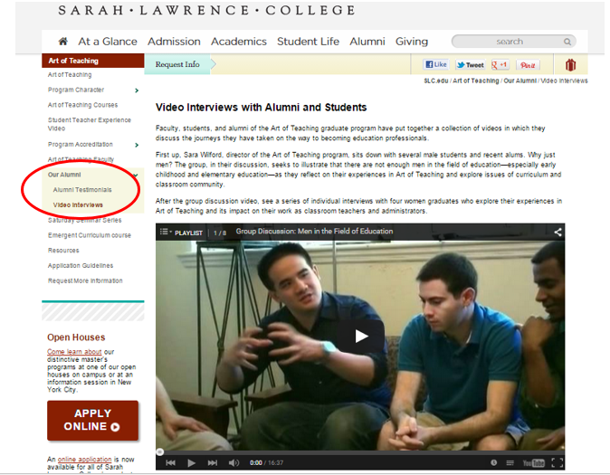
In this example, Sarah Lawrence College beefs up its Alumni section by adding video interviews with graduates and new students:
And here’s how Dalhousie University enlivens its Admissions page with visuals to help segment information, and lead visitors toward important conversion steps.

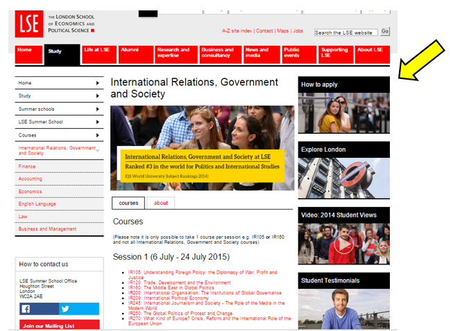
Program pages are an ideal location to showcase visuals, rather than bombarding your website visitors with chunks of text. Take a look at how the London School of Economics and Political Science presents its program for International Relations, Government and Society. The page puts student-oriented visuals (including video) front and center, rather than relying on textual descriptions:
A smart way to begin working with more visuals is to organize an image bank. Take inventory of the visuals you’ve already got, categorize them by theme, and store them in a central (preferably cloud-based) location – such as Dropbox or Google Drive.
Then you’ll be able to see where the gaps are, and begin putting together new visual content for key sections of your website.
5. You’ve Underestimated the Power of Creative Story-telling
Storytelling is a crucial part of your school’s recruitment content strategy and development. Done well, it helps authenticate and differentiate your brand identity, attract your targeted audiences, and build trust through a shared sense of purpose.
There are so many ways to integrate great stories across your website. We’ve covered a few already in the previous sections on visuals and faculty promotion, but here are a couple more important storytelling devices every school website should include:
1. Student Success Profiles
Prospective students need to see people like them on your website; individuals who have faced and overcome similar challenges, strive toward the same kinds of goals, and have ultimately achieved success by attending your institution. Done well, these kinds of stories are tremendously motivational, and when strategically paired with CTAs, will definitely boost inquiries through your website.
Stenberg College provides an ideal example of what we mean with its “I Changed Me” campaign. Rather than directly promoting itself, the college celebrates the tenacity and resolve of its students – and creates a dedicated space on the website in which to share their remarkable stories. Of course, Stenberg benefits enormously from this type of story-telling, but it never comes across as a sales pitch.

2. Testimonials
Testimonials are similar to, but a bit different from student profiles. These are direct endorsements of your school, the student experience, faculty, etc. and are typically shorter than biographical success stories.
In order to support student recruitment through your website, you need personal narratives from your teachers, administrative staff, new and established students, alumni – and even industry representatives who work with your interns and hire your graduates.
Testimonials must come from all sides in order to paint a complete and authentic picture of what life is like at your school, and the concrete benefits of enrollment. And don’t forget to include a visual!
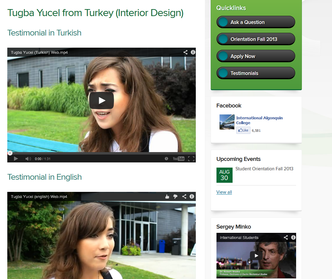
Here’s a great example from Algonquin College, which offers video testimonials in several languages to help connect with and recruit international students online.
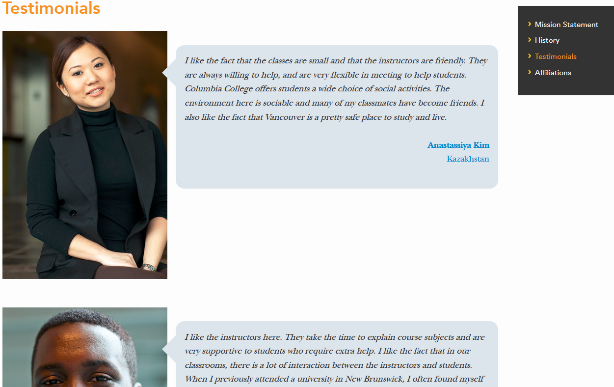
Or, this example from Columbia College’s testimonials section, where student portraits are effectively combined with short testimonials:
There really is no place on your school website that wouldn’t benefit from testimonials. From short quotes to videos to interviews with your industry partners – if you’re not leveraging this most persuasive form of story-telling, you’re definitely limiting your website’s capacity to convert.
6. You’re not Optimized for Search Engines
So far, we’ve talked a lot about persuasive content. But how can you expect potential students to actually engage with your website content if you’re ranking poorly in search results? Research shows that 85% of high school seniors turn to search engines to explore their post-secondary options. Will your school’s website make it onto their radar?
If you’re not performing regular keyword research based on your persona’s preferences, and then optimizing your web pages (including the title tag) with those keywords, you’re restricting your online visibility – and therefore, your capacity to generate new student leads.
Another key SEO tool is your blog. Publishing and promoting regular, persona-focused articles that incorporate priority keywords is fundamental to inbound marketing for schools. This strategy helps drive organic traffic to your website while positioning your institution as knowledgeable, relatable, and trustworthy.
7. You’re Missing On-page Forms
Schools need lead generation mechanisms to effectively increase inquiries. Too often, institutions shy away from the on-page sign up form because they fear being perceived as too “pushy.” There is some truth in that fear. If your website is overtly self-promotional, lacks authentic storytelling, and doesn’t cater content to personas’ wants and needs – then yes, your sign-up form could indeed be perceived as just one more empty sales pitch.
On the other hand, if you’ve offered compelling, engaging, truthful content, and created a beautiful user experience, your visitors won’t balk at completing a “Request Info” form.
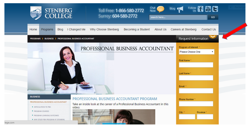
Here’s a good example from Stenberg College, who uses the same Request Info form across their website. They’ve done such a great job with content that the form doesn’t come across as obtrusive, or an untrustworthy grab for personal information:
If your website is missing forms like this, than your school is overlooking a huge opportunity to add to its contact list and lead nurturing campaigns. Plus, a contact form can yield valuable information about your visitors, such as their program of interest and which city they live in. You can then leverage these insights to refine recruitment campaigns and new content for your website.
And there you have it. If any of these seven website sins sounds familiar, you could be sabotaging recruitment via the online channel students value most when making school decisions.
What other website features do you think play an important role in attracting, engaging, and converting new students online? We welcome your insights and questions in the section below.
![]()


