The term user experience (UX) gets thrown around a lot in digital marketing circles when discussing web design. However, it is often misunderstood, both in terms of its components and its implementation.
UX design involves considering the overall human experience a website provides, rather than just its aesthetic appeal or basic usability. It can involve evaluating everything from written content to visuals to site architecture in pinpointing how to make your web presence as seamless and intuitive as possible for visitors.
For those in education, a sector which often faces challenges serving their audience on the web, thinking in terms of UX can be especially valuable. Read on to find out why.

What is UX? An Overview for Higher Ed Professionals
To understand UX, it is probably best to think about it in practical terms. For example, consider the last time you made an online purchase. How easy or difficult was it to find what you were looking for? Was the transaction process smooth, or was it frustrating? Did it take a long time? Did everything work the way you expected it to, or did you experience problems? This is what UX design is all about.
In essence, UX design focuses on how a website works. However, UX experts are often keen to stress that the concept goes far beyond mere usability to cover a broad spectrum of different facets. This is perhaps best illustrated by Peter Morville’s “User Experience Honeycomb”:

The UX design process also goes far beyond ordinary education website design and development, and will often incorporate:
Research- This can include surveys, interviews with prospects, persona creation, and even preliminary user testing when redesigning existing sites.
Design- UX design typically involves creating anything to do with the underlying structure of a site, such as its information architecture and web page wireframes. Design and development teams will usually turn these into templates or prototypes for testing.
User Testing- UX design involves a lot of testing, preferably with real web users. Split tests and beta tests are also common. This allows website owners to be sure that the process will yield the improved end product they are looking for.
Achieving this goal involves striking a delicate balance between the needs of customers, the needs of the organization, and the capabilities of the technology at its disposal. It is also a multilayered concept, taking in everything from the visual appeal of the front-end interface of a website, to its underlying structure, to its role in fulfilling the organization’s business goals.

Source: Jesse James Garett via Marvel
This massive scope is what makes UX design such a valuable approach for those looking to improve their digital marketing initiatives. By emphasizing a process that puts the needs of your audience first, you can create a site that they will not only use, but enjoy visiting.
Why is UX Design for Education Websites Important?
For schools, improving UX can be a vital factor in generating inquiries and applications from prospective students. When you make the most relevant information on your site easier for visitors to find, you are clearing the path towards conversion.
Example: The Centre of English Studies website features a sticky header which includes CTAs that prospects can click to get a quote or make a booking. Not only does having these options readily available encourage conversions, it’s also very convenient for users.

Creating a more immersive, enjoyable online presence also makes a great first impression on users, and will encourage them to stay on your site and browse it for longer periods of time. This leads to them discover more information about your school and what it has to offer, which can only help your chances once they reach the decision stage in the enrollment journey.
Example: The Unity College website is good example of one that is inviting and appealing from a UX standpoint. With a well-thought out layout and an aesthetically appealing design, it immediately gives prospective students the impression that there is plenty there to discover and enjoy.

However, it’s worth noting that schools looking to evaluate UX shouldn’t view their site exclusively from the point of view of prospects. We’ve noted before that a common criticism of higher ed websites is that they are often too focused on recruitment.
While it is understandable that institutions want to focus on attracting inquiries, it’s important to realize that your website also needs to cater to a number of other interested audiences, including current students, alumni, parents, the local community, media, and even your own staff. These people are your community, existing customer base, and ultimately your strongest advocates. Providing valuable resources and communication channels for them can be valuable in building your reputation. What’s more, every potential applicant you attract is hoping to become a student one day, and it’s important for them to see that they will be looked after when they do.
Unfortunately for many schools, the problem with this is that providing everyone with the information they need involves a lot of organization. This can be difficult to do without your site becoming messy and cluttered. This is where the UX design process becomes invaluable, helping your school to determine an information architecture that will make your online presence as straightforward as possible for the greatest proportion of your audience.
Tips for Evaluating and Improving UX in Education Website Design
When it comes to identifying how UX design for education websites can be improved, the process can be complicated, and depending on the school, the results might also vary. Your issues could be due to simple visual design, have more to do with navigability, or come down to technical issues. Here are a few common areas where UX design experts will look to make improvements:
Information architecture- As we previously noted, websites for education institutions can need to be very extensive, with page after page of information required to serve different needs. As a result, creating menus that make it easy for prospects, current students, and other users to find what they need can be a challenge. Many schools remedy this by rethinking their menu hierarchy, and even establishing separate sections of their website for different audiences.
Example: The University of Sydney’s homepage uses a tiered menu to make the different facets of its site more discoverable.

Hovering over the different tabs reveals more options for the user. It’s a great example of how to get as much above the fold as possible on a homepage, without overcrowding your design and overwhelming the user with information.

White space: While it might be tempting to cram every available area of your web pages with information or CTAs, it’s essential to have a decent amount of ‘white space’ on your site (note: it doesn’t necessarily have to be white). White space ensures that a prospect’s attention is drawn to the most important elements of the page, rather than being confused and overwhelmed by lots of different things vying for their attention.
Even small amounts of white space can make a difference. For instance, when setting the text on a page, it’s important to use paragraphs frequently in order to avoid having massive blocks of text, which can be off-putting for the reader.
Example: On McGill University’s homepage, white space is used effectively to create a simple layout. It’s also worth noting that pertinent information such as programs and other resources are easily accessible, enabling prospects to go straight to the information they are seeking.

Use of common internet visual cues: There are certain visual cues which web users have come to understand to be indicative of different things. Bolded, underlined, blue text in the body of a paragraph is probably a hyperlink. A magnifying glass icon is a search menu. Downwards arrows or plus signs usually indicate a dropdown or accordion menu.
These established design norms help people to navigate websites more easily, even if they have never visited them before. So, while designers are often tempted put their own spin on these elements, or use something unique to their branding, sticking with a conventional approach can often be better for UX.
Example: The “hamburger menu” is a great example of a common visual cue. This icon is generally understood to mean that there is an additional menu of items that users are not seeing on the page, and encourages them to find out more. It is quite common in responsive designs for mobiles, where space is of the essence.
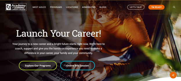
Use of visuals: Having a rich, engaging mix of visuals on your site can also be important to UX. Visuals can provide a break from text, help to illustrate certain ideas or concepts, and convey your brand identity.
Example: The Academy of Learning Career College uses visuals to make its homepage both engaging and unique.

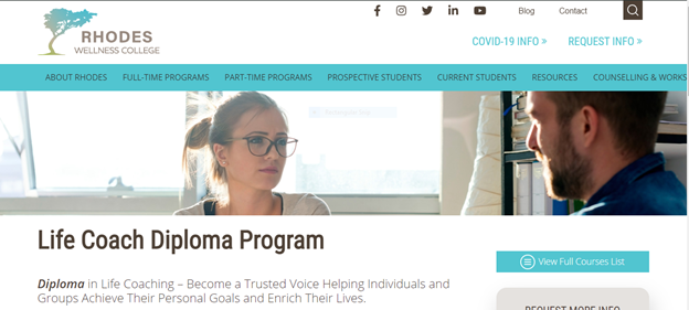
Consistency: Have you ever clicked on a menu item on a homepage, only to be brought to a page that looks like an entirely different site? Inconsistent design can be very jarring to web users. A page with a different menu hierarchy, layout, or visual design to the rest of your site essentially forces visitors to relearn how to find what they are looking for all over again. While different sections of your website will naturally need to be laid out somewhat differently in order to convey certain information, keeping some consistent elements will help keep your site grounded.
Example: Rhodes Wellness College does a good job of keeping its page layout and general design elements of its website consistent, even when the information displayed on each page is very different.


Headline Copy: Page titles and headers are one of the most important elements of a web page for both web users and search engines. A well-written headline, preferably incorporating a keyword, can be vital to grabbing a user’s attention and letting them know that the page will provide the information they are looking for. Conversely, a confusing or vague headline – or for that matter, one which forces a keyword into the text in an unnatural way – can quickly drive a prospect away from a page.
Slow site speed: Often an overlooked element of web design, site speed can be evaluated using Google PageSpeed Insights. If you find your site is running slow, there are a number of things you might be able to do to improve it, such as compressing the images on your pages. Site speed can be particularly important for schools targeting international students, as broadband speeds can vary greatly in different countries.
Responsive design: It’s vitally important to ensure that site designs are responsive and optimized for all kinds of devices. Google Search Console’s Mobile-Friendly Test can be a great tool for testing the responsiveness of your site.
However, it is important to also evaluate your site manually by logging on using different devices, as the tool may not detect a number of issues with your pages, such as missing elements or design inconsistencies.
Broken or incorrect links: While search engines tend not to punish 404 errors or broken links too harshly, users can be extremely put off by them. Using Google Search Console to crawl your site and identify any broken links can make a huge difference when it comes to UX design in education.
There also any number of other issues that may affect your site’s UX depending on your school’s needs and admissions processes, such as form submissions, payment gateway integration, use of video and other multimedia, and more. Thoroughly evaluating how your site functions and its end goals will help to pinpoint potential challenges and issues.
The Relationship Between UX and CRO
Because providing a better user experience is often crucial to driving conversions, UX also often goes hand in hand with conversion rate optimization. The completion of online forms, CTAs, and other website goals can often come down to how easy and natural you make it for users to navigate from one point to the other and find what they are looking for.
Application forms, for example, are often abandoned by users because they take too much time, are difficult to understand, or are just overly complicated. A good UX design can help to make them more straightforward, making it easier for students to apply and improving your conversion rates.
Example: St Giles International breaks down their booking form into steps to make it simpler for users. Note how the school also has a sticky header with a phone number and email for any prospective student who is having trouble.

Keeping UX in mind when looking to improve on CRO and vice versa can be very beneficial. It allows you to consider both the needs of your school in relation to its recruitment goals and the needs of your prospective students, striking the right balance between the two.
Measuring UX Design for Education Websites
Although UX can be difficult to measure, there are a number of data sources you can look to that will provide indicators of how intuitive your website is for users to navigate. For example, conversion rate optimization tools like heatmaps, click maps, and form analysis software all provide insights into how easy you are making it for prospects to achieve their goals. Likewise, the results of A/B tests which have been set up for elements related to UX can be very instructive.
At a more basic level, your Google Analytics data can also provide a window into your website UX by showing you what web pages users are landing on, where they are exiting, and what path they follow to complete specific goals. It can also provide more practical insights into page load times, time spent on specific web pages, and site speed.
Certain GA goals can also be indicative of UX. For instance, a school looking to evaluate a multi-stage application or booking form could set individual goals for each page URL in order to determine which steps were being completed and what point users were dropping off. This could possibly tell you what parts of your application process prospects struggle with.
However, perhaps more than anything, qualitative feedback is the ultimate litmus test for UX, and designers in the field will often encourage site owners to test their design changes on as many real users as possible. By seeking the opinions and suggestions of real prospects who share the motivations of your target audience, you can create a web experience that truly caters to their needs.
More and more schools are beginning to realize the importance of thorough and dedicated UX evaluation in web design. By putting the needs of your target personas first and creating a web experience that they find enjoyable and immersive, you can see lasting improvements in the effectiveness of your website in driving enrollments. Essentially, it’s a win-win for your school and your prospective students.
**Editor’s Note: This blog was originally published on March 13, 2019, but has been updated to better reflect current industry trends and best practices.


