The rapid rise of internet-ready mobile technology has had web designers rushing to keep up. While the online landscape is shifting so quickly that last year’s research becomes swiftly irrelevant, college recruiters should take notice that their target demographic is engaging more than ever on smartphones and tablets. Teenagers represent the leading edge of mobile connectivity and according to a recent Pew study, 50 percent of teens are more likely to go online with smartphones rather than traditional computers.
The recently released 2013 E-Expectations Report noted that 43 percent of college-bound students use their mobile devices for all web browsing! The fact that eight in ten respondents, and a third of the mobile-exclusive group, expressed a preference for using a PC or laptop to view higher ed websites might imply that most of these sites still aren’t very mobile-friendly. On the other hand, since a majority of students surveyed have looked at college websites on their mobile devices, schools should do their best to make their sites as user-friendly as possible, no matter the platform.
Responsive Web Design (RWD) is a leading trend in optimizing content so that it is well received on devices of all shapes and sizes, from tiny smartphones to big-screen smart TVs. Unlike creating a separate mobile page, RWD makes a site’s design and content recognize and adapt to whatever device the student is using (including potential future inventions) with minimal resizing, scrolling or panning required. The phenomenon has been impossible to ignore this year for web designers and in previous blogs we have analyzed its pros and cons as a tool for student recruitment. Recognizing that prospective students have little patience for poorly functioning websites, most schools are now at some stage of making their sites responsive. In a higher ed survey from earlier this year, 51% of respondents with an existing solution have already adopted the responsive web design approach. In 2012 only 15% mentioned using responsive techniques.
RWD is particularly effective for content-heavy higher ed sites but readability is the key consideration. A large, busy design on traditional screens will remain overly cluttered on handheld devices unless properly implemented. For example, Notre Dame’s acclaimed newly redesigned website removed some of its page’s heavier items for smaller mobile browsers. The site automatically adapts page structures to enable smooth navigation. A good rule of thumb is “don’t make people squint to read!”
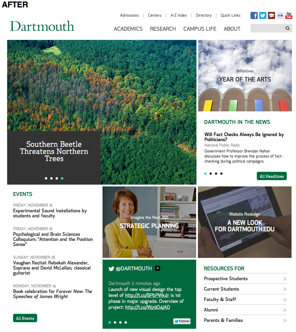
 Source: collegewebeditor.com
Mobile-first approach
Going responsive may seem daunting under a limited budget but it is cheaper and more convenient than developing a mobile-specific site, and maintaining a consistent URL has several advantages, particularly for sharing in social media marketing. Google has even indicated that it prefers responsive sites for search engine rankings. An ideal way to get started is with a mobile-first approach, ensuring optimal functionality for smartphone users and building up from there. By enhancing experiences with each device in this order, you can launch the mobile version first rather than waiting for a full website redesign to be mobile-optimized.
Under a mobile-first strategy, the web design team needs to understand the pages and actions that visitors are using most on their site. Studying your Google Analytics is the best way of prioritizing implementation and focusing efforts on the right information. Integrate analytics into your RWD development to allow for continuous monitoring and improvement. Top content priorities identified by students in the E-Expectations Report included academic programs listings, orientation details and cost or tuition details, with an expressed willingness to complete forms on mobile devices, such as requesting information, calculating scholarships and cost, and scheduling visits.
Example: Dartmouth College wanted to demonstrate mobile-optimization progress as early as possible, so worked with their internal team to quickly implement three templates into their architecture and content without making substantial changes. The new responsive home page opens with primary topics: Academics, Campus Life, Research, and About. In the coming months, an entirely new architecture will debut with a consolidation of structure to balance simplicity and the school’s ethos.
Responsive vs. Adaptive
While a mobile-first approach is intuitively appealing, anecdotal evidence suggests it is rarely implemented because it requires a serious content reduction. We are interested in hearing your opinions on the subject!
Businesses in various industries are increasingly looking beyond responsive design in an effort to become fully interactive and improve the all-important load times. Every second of delay in page loading has been estimated to cause a 7 percent reduction in conversion rate! The “adaptive” approach includes elements of responsive layouts but integrates JavaScript to add interactions and features, technically delivering different stylesheets to different devices and excluding certain content types and templates from certain devices. For example, not delivering a Flash video player to devices that can’t play it.
Adding adaptive templates to an existing website can deliver customized, device-optimized web pages without having to rebuild from the ground up, providing a quicker fix than the investment necessary for responsive design. Responsive designs are inherently complex because they are trying to support many viewing experiences without necessarily optimizing for one particular device. Still, well implemented RWD may be the optimal solution for your school – it depends on your content. A near future of the internet could be “intelligent web design,” where websites are both responsive and adaptive at the same time. Regardless of which approach you use, it is undeniable that mobile browsing is the future, and colleges and universities can’t afford to ignore this trend.
Which strategy has your school applied to optimize for mobile users?


